Thursday 22 May 2014

FMP evaluation


Briefly describe the final outcome of your project and the progress you have made, and if applicable how it differs from your original Project Proposal:

My branding project has turned out to be successful even though i did not achieve all targets as listed in the proposal, however all important parts were achieved to a high level. 
The final pieces worked well and the whole brand came together. There are  applications to show this along with gameplay screen shots, logo, merchandise, character design and advertising. Merchandise includes canvas bags, t-shirts and packaging. I thought about doing something different as there are many brands out there, I even presented the brand in my own way - the illustration of black and white outlines for mobile devices. 
The characters i created took longer than planned, this was due to it being a first experience and did not know what the expect. i had to try out different media and development before starting on these models. It was also difficult painting and drawing on a 3D surface as it was something new for me, but i would say i have done a good job within the time limit with many other targets to meet.
There are more that could have been done, for example webpages, videos, trailers. but time was limited to 7 weeks and my knowledge to programs were limited therefore it was difficult to include them. In the future i would very interested to learn motion graphics programs such as after effects to build my knowledge in graphic design, if there were more time i would have some simple videos of moving scenes for the game. 


What methods have you used to show how your learning has effected your project eg FMP Blog/ FMP Plan/ sketchbooks etc, and how has this helped with development of your work:

I found using my sketchbook one of the most important aspects in order to enhance this project, the sketchbook is where i really put down everything i thought of, put down all the research that i have done with detail of analysing. i can always refer to my sketchbook to get ideas when i am stuck, it helped me start ideas, start development of my final project. 

As well as my sketchbook, the blog has has also helped me problem solve, the blog is where i analyse and talk about my work, sometimes when i blog and my work becomes digital, it becomes more clear that some parts may not work as good. Therefore i go back to my sketch book and re design or change parts that are necessary. 

I developed my skills when i visit galleries, to be inspired and to develop my ideas for my own project, there are many exhibitions that ravensbourne has brought us to which really helped my illustrations and my brand. I understand more how to analyse different artist's work. i understand that most of the time in research i don't have to research into the same area. i had many ideas from not researching into games but instead looking into fashion, science, illustrations styles, music and more. 

The FMP plan helped me in a certain extent, it helped me start project as i was a little bit confused of where i begin but as the weeks went along i think it helped me less, this could be just a personal preference as i am always organised and maybe didn't feel the plan helped as much. 


List the targets met (from the original FMP Plan and any that were added later):

Target met 
name and logo
character design
advertising (photography, illustrations - posters, packaging) 
applications and merchandise (gameplay, t-shirt print, packaging, canvas bags)


Target not met 
Character design - looking into movement of characters eg postures. 
Advertising - billboards, flyers, webpage, video/trailer 


Reflecting on your overall final major project, please discuss any developments which have contributed to the final outcome:

There were many struggles and ideas to overcome and choose to develop. For the logo, coming up with name was harder than expected. Lots of names were an idea but didn't feel if it was the one. Finally chosen the name to be AVMO, i started a very simple questionnaire asking around 40 people - what does AVMO sound like to you? - most people answered with some sort of game. That was what made me decide to develop that name. 

The type i wanted to go for needed to be individual, therefore i did not try and choose an existent font apart from sub titles. the actual logo i wanted it to be created personal for it to become unique. i wanted to give the impression of some kind of war game, hence i added the weaponry onto the font, and monster looking character for the letter "O". At first the letter didn't really work with the illustration, i then began making the letters A V M O more of a solid type and bold. The small illustration suited with the solid background of the letters. 

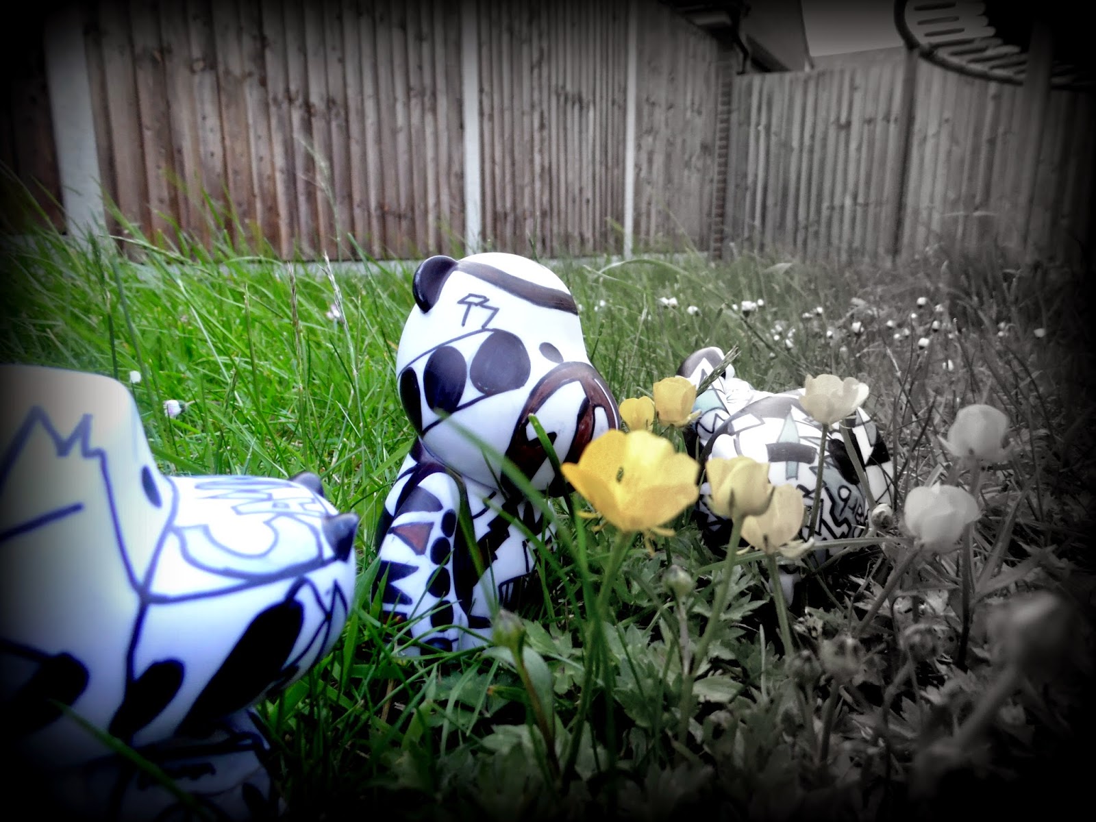
The development of 3D models and back to 2D was a new concept for me, this was one of the major development of my brand. First making the models (3D), testing different media and seeing which worked best. Each media gave different texture and different shades of colour, i chose to use markers over paint as it stuck to the model better, the colour is more vibrant, it dried quicker and it worked like acrylic when mixing colours. 
After making the models I photographed them with high quality camera, i put the models in context, i thought about the scenes and background before photographing and editing them. The project has definitely made me realise the importance of photography. 

After photographing them, i wanted to take the models to more 2D and i converted them into illustration, i used adobe illustrator and editing them, this turn out i think one of the best pieces i have done so far. I realise developing something from 3D to 2D can really help me understand it mroe as it was something physical and realistic that first worked with. 

Please state what advice you received from others during your FMP, and discuss what you found particularly useful: you should refer to group reviews, one-to-one tutorials and feedback from evaluation groups

In tutorials, the tutors really helped me by telling me whether I'm on target or off target with the time limit. This helped me realise how much less time i had to completed this project and made me worked harder and more efficiently. Tutorials also help me keep up to date with my work, they ensure that my sketchbook is up to date and not falling behind. 

the feedback week from other students, ensured me as well with my sketchbook. It seemed like i have been working to the expected standard receiving merit/distinction as a target. Another aspect was that i needed ti show more problem solving in my sketchbook. This i found hard as sometimes many problem solve i do is continuous and doesn't really appear on my sketchbook, when i evaluate i mention this therefore most is on the blog. 

Key points to take away – things to change about my approach (give at least 2) eg improve time management, what skills you have developed and how this will affect your future course/career and things to continue doing and to build on.
What are you going to do next year?

I have learnt fruitful amount to be a better designer/illustrator, I learnt the ability to work on and turning something 3D back to 2D can be a very effective way of working as it made me understand more about the object due to the physical handling and actually working on a realistic piece. It helped me develop the 2D piece to be much stronger and easier in some ways.

That photography can enhance your work and can develop your work when illustrating. I learnt this as the photographs i took with the models, placing them in a scene and certain background gave me ideas in illustrating posters, the high quality picture also helped me edit in photoshop and then based on those photos develop my illustrations. 

I have developed my program techniques especially in adobe illustrator, i discovered many new tools and options which i can build and enhance my work. I tried presenting my work in a different way, trying something new and always experiment. 

This project has made me as a designer to always make physical things and see how they can work when turned back to 2D. it changed how I view galleries and exhibitions, realising how effective these visits can be. I also realise that inspiration can come from anywhere and really not to stick the subject that your project is about, always look in other directions and angles eg fashion etc. Also in the future i would take photography with more effort as it sometimes really do help whether its ideas development or enhancing final pieces. 

Next year i would be doing a Graphic and Illustration degree course at Loughborough university, i would like to particularly experiment motion graphics, animation and improve on my illustration skill whether if its on paper or digital. 

Packaging

Packing is a very important part whether is advertising or aesthetics, it sets the first impression of something.   i wanted the packing to be have my AVMO logo separated and to keep the character inside  mystery so the buyer does not know which model they are getting.

However i thought the logo has appeared many times on the application part already, so for the packaging i wanted to go for something more related to the character.

i chose the colour as the main key. My characters all have their own individual colour. i made this appear in the packaging. for example, the Cannon character is grey, and for the packaging i used different shades of grey for each side of the box.

the model i wanted to keep to a mystery at an extent, so i only gave the outline of the model on the packaging as a clue to what the model is like.


Using layers in illustrator, to give a sense of composition and overlap, on the sides of the box, i used opacity to 10% in the background of the outlined character, i wanted the repetition because of the army idea.

i think the packaging has worked well, it achieved my targets
- sets a good impression
- has clue to which character is inside
- a sense of advertising - websites and logo.

Application

To really show and help people understand my game, i did a series of application of what's the brand is like. - including gameplay.

I could have placed the logo, gameplay, start up screen in a realistic scale in an ipad or iphone. I wanted to go for something different and just have the outline of the mobile device in black and show my logo and what my game play is like.
This was because of the amount of colours that already exists during the game and i think the plain outline would help enhance the attractiveness of the application.


the outline worked well, the colours stood out , it made sense,easy to tell what the outline is, its clear.

applying my logo to merchandise such as bags and t-shirts. i think the logo works well and for some parts it can work as an individual, so the A could become a character of its own, so can the V, M, and O.

Applying the merchandise, especially packaging can become a collectable, which can help increase sales.

Having the t-shirt printed i liked the idea of the reptition of the logo as i thouguht this gave the idea of army. - the scenes where army lines up neatly in groups of 100s.


Illustration for advertisement - posters

After the photography, i wanted to take it to the next level and really converting the 3D models to 2D. I want to apply the research i have done from designers and illustrators that i have researched to a piece of illustration for my character for a poster.

Of course i want to apply my own style too, at first i had the idea of technical drawing of human, - similar to those used in science scans where a human body is scanned and a cross hatch image of the body are shown on the screen. 
i wanted this effect as it is realistic and accurate, i wanted these model is look realistic just like a human. i want them to have a personality. 

My adobe illustrator skill has certainly improved i discovered many tool and options in-order to help my final pieces posters.


After drawing my character on illustrator and adding the style i wanted to, i didit like it as i did or the idea didnt really work. i think it seemed a bit unclear, although i think the colour and the style is ok, i think as a poster for the public may be a little bit off topic. 

This could work as a collector poster, or a general poster for gamers to collect, but i think this would work as a advert. 

Therefore i went on a completely different route, i illustrated my model and went abstract but at the same related to the character itself. 


I think this worked well, and works as a advertising piece, i wanted to express art and illustration as much as possible. i wanted to act it as if i was presenting it in a gallery or a exhibition- using the public space as a exhibition. i think this idea will attract reader/viewers because we see minimum illustration in posters in public.

i used the the character, colour, opacity, shades of colours, and abstract background to attract the viewer and then they will be able to notice that it is a new game thats out. 

the character is names TANK, and the background of course has relations with the personality. the background is almost like a war scene in the game, at first without the opacity, the poster was too intense and too abstract. but with the opacity, it cooled down and made the poster more calm, less abstract and more appropriate for an advert.

I learnt 
- Problem solve 
- More illustrator skills 
- To be Less abstract in situations 


Photography and editing


I wanted to give some realism to the models, i tried using photography to do this. Putting them in real scale - in the garden, in between grass makes them look like in game play, i also created a little mock up model of a scene using simple cardboard and paper.

I also used photoshop to edit, i learnt more photoshop skills in this project as i don't use it much, i particulalrly like the neon and glow in the dark effect, it make the three characters more fiercely and more of a war scene. i think they work as a advertisement piece just as a photo as it in interesting to look at and i think it would stand out due to the vibrancy and heavy editing - the unusual use of colour.
The photo editing made me think more about the background colour, it became something important as it could made the characters stand out and sets the mood of the picture.

i also then thought about the posture of the model, how they stand the positioning of them, the order they are in, i learnt that these are all important aspects of photography and enhancing the picture. i chose the model to look at a certain way, how they two models on the side are head tilted toward the reader but their angle set at an angle to give it realism and eye connection to the reader.

I have Learnt

- Photography
- Photoshop
- Editing
- Application to real life situation and 3D to 2D
- Model making
- Posture and composition

Wednesday 21 May 2014

Creating characters for the game. - models


These are models that i have made and painted. as it was my first time experimenting the material and the surface texture, some other models were not as good as the media chosen was not as good.

i began using acrylic paint on the vinyl models, it didn't work as well as expected - the paint did not stick to the material, maybe the model needed priming.


I then tried using a different media - graphic markers. this worked better but the ink had to be left to dry before working onto the next step.

i think these models works well due to it really have developed their own personality, the colour, shapes and   objects have made them individual and unique almost like a human. Because of this the models work very well with lots of space, it really grabs peoples attention.

This was a new way for me to express art and illustration, for some models i stopped thinking of the model as being a character but as paper, - as if the 3D model is a piece of paper and i am illustrating on it. A different form of expressing art.

I also took these models and photographed, i wanted to use them as advertising pieces as they really had they own uniqueness and their own personality. You can tell some are more angry, some are more friendly. this is all down to the colour, the pattern, the weapon, the emotions of how their facial features are expressed etc.

To transfer these 3D to 2D and see how they might work as illustrations and photography.

Friday 2 May 2014

Pick Me Up exhibition


1) This was a piece that attracted to me due to its intricateness and neat straight edges. very vector and accurate, colours are well organised with shadow and opacity. all these components creates a unique very tidy piece of illustration. This is something i can try with my characters, and logo.

2) The small prints were done from a tiny press, i think size plays a part in this piece, sometimes size can be a factor of being a interesting piece and the amount, all of them on a table was very tidy and organised, the texture by the press made them more special.

3) This piece taught me space, the title being at the top and the main illustration at the bottom leaving the space in the middle creates a unique composition, its tidy and not abstract. its simple and understable. the texture and the stroke on the two people were concentrated as a viewer due to the empty space.

Pick Me Up exhibition


This was an interesting illustrator, his work gave me the idea of childhood, i think its a unique because he used learnt skill, mature skilled to develop these children like illustrations, this means that pieces can be intricate and colour is planned and well thought, eg the model is very simple but its intersting to look at, its random but works, the artist thought through it and whether its shapes and colour combination.

Its a different type of illustration, certainly not the same as most illustration, it was something new and different therefore it stood out.


Pick Me Up exhibition

This was one of the most interesting exhibition i have been to due to its similarities and illustrative styles compared to my work, although work were similar i noticed and realised how many ways things can be done, eg the use of coloured paper, they are many ways of block colouring - different boldness gives a different style/charter to the piece. some colour blocking pieces seemed to be much more delicate than others. the exhibition showed although similar pieces and illustrations there are many ways things can be done. There were artist who developed their work to 3D which is what i am doing for my FMP, it was nice to see how other people turn their piece into 3 dimensional, it was another point of view which i can look into.


This artist attracted my attention the most, mainly is what iam into - the colours, shapes and a combination with characters. However this artist has shown me a different way of illustration, i usually block in colours with black outlines, this is a change and something different to my style and i think it works better and more different. maybe in the future i could combine these techniques and mine into one piece of illustration ?    

the artist really thought about colour combination and background, something i need to look more into.
                                   

Sunday 27 April 2014

Iphone app icon


Developing iphone app icon, adding the title into it as the logo is not clear - keeping the title small and leaving space in the logo for the vibrant type to be the centre of attention. 
Tested different types of fonts and colours and opacity. the black font makes a subtle appearance from the grey background of the icon. this fulfilled my target as i wanted the vibrant part to standout at the same time i want it to be understandable, the title on the corner does the job, its subtle and slanted to give a sign of aut