Thursday 31 October 2013

Project 2 Day 2

After our group went back and thought about the story board, we had more interesting ideas. Instead of filming we can use time lapse - this relates to our topic as we are showing time and time lapse in a way can show the sequence of time. We decide to do a mixture of filming and time lapse. After consolidating the concept we started filming. Because we are doing a mixture technique we filmed and took pictures at the same time. In the relations of typography, we will edit the film afterwards.

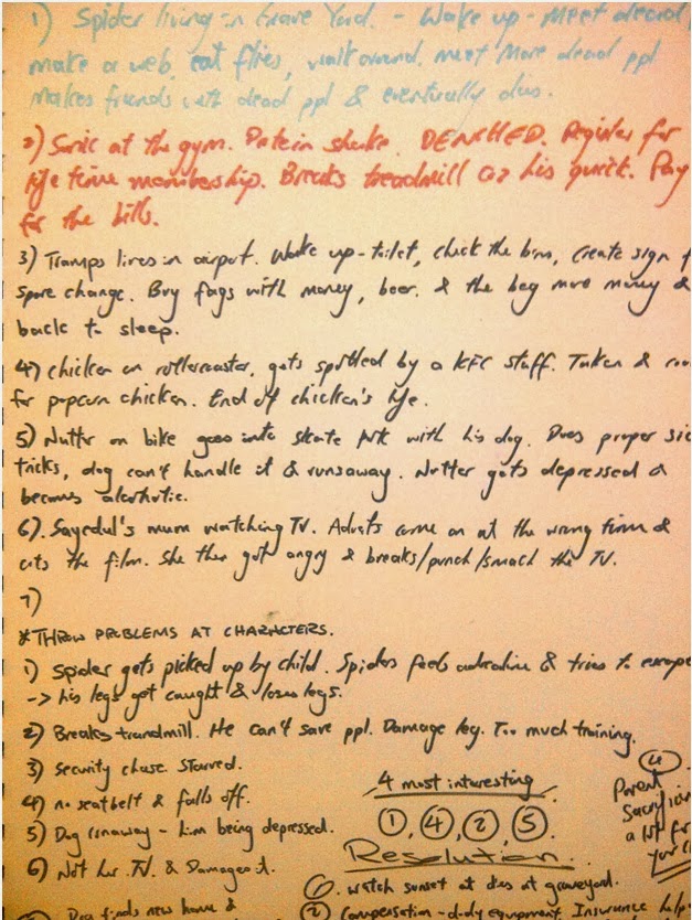
I researched in book and youtube, to see effects that we can apply to the film, also looking how tramp, alcoholic, homeless people behave and their daily routine.
I wrote key words, and expressed feelings on paper.


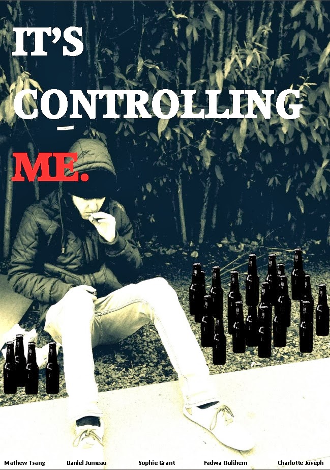
While researching, ideas developed for my posters, because this topic can be sensitive and quite serious i want to work on that. ideas like showing the relations between crime scene with beer bottles, having the beers bigger than the human being shows the denominator, also ideas on effects, eg the whole poster can be distorted meaning seeing from the alcoholic perspective.


While doing the i changed our actor to a more negative colour and posture, posture is looking down and weak, trying to relate the topic. The title "Its controlling me", i used the word it as it is very anonymous which can grab attention, i made the word "me" in red, this is because i want to make this stand out for the audience to read, i try to cause the audience to connect with the poster by saying "me". The idea of the scale bottles did not work as the colours and the picture did not blend together as well i think, therefore i changed the glass bottles to black and kept it to scale, i used black as it is an usual colour for beer, and black adds more negative and even a sign of danger to the poster. I have also made the full stop very bold as i wanted to make a definite stop, to tell the audience the importance of the title and the seriousness of it. to ensure to grab the readers attention about "Me". 


Tuesday 29 October 2013

Project 2 Creating a film

Having seen the film about typography at the start of the day improved my view on the importance of typography in business. I want to relate what i learnt from the video to this film and my poster during this week. Our keyword is CONTROL. We have to create a film based on this word so first we came up with lots of different types of definition for it as a starting point.


we looked at the term in science, environment, self control, actions, building and type of strokes, diet, army and more. As a group we agreed on the self control idea linking it with alcohol and drug how these things can take control over a person.
We wanted the audience to be more connected and natural about this film, maybe we will keep the movie with the natural background noise and no music. i want to use words and typography to explain the feelings that comes across in the film. 
Maybe we see road signs or the alcoholic holding his signs etc. to be further discussed on Wednesday. 
Here are notes and some story developing notes.


While developing i find drawing and scribbling very helpful to develop ideas, it is more visual and easier to enhance and talk about ideas for me. I tried out different physical side of this keyword, for example spinning movements and out of control strokes.


Monday 28 October 2013

Graphics pathway Project 1

For this first project, i wanted to tell people what type of graphic design i want to go into and enjoy the most, there are some typography involved in my 180 x 180 square, but my main impression is illustration. I like to work with a wide range of colours in my designs, experimenting is always a key for me. My style here is influenced by designer/artist Jon Burgerman. His technique is unplanned which i find interesting as each piece can differ from each other in many ways, his use of colours are well chosen, it is not always just lots of colours mix together, some of his work are very subtle clean and simple colours yet others can be more abstracted.


Here i used mixture of strokes and 3 colours. i wanted a simple outcome and less abstracted as my portfolio at the moment is not as controlled.

Using variety of colours to give he piece a completely different character and atmosphere. 

The colour combination here reminds me of a country such as Brazil. 


Thursday 17 October 2013

Evaluate Foundation course


This course so far has developed my skills even more due to the amount of different pathway I experienced. Having met new people who do similar subjects as me helped me understand the concept and the theory of collaboration. I realise how nearly every pathway in design connects with each other and can help develop a product or an image better. As a whole, this course has made my attitude and thinking more mature in the design industry, whether is how things can influence my work or the relationship between creativity and business. Although I was fascinated in the fashion week due to the concept based work and unlimited freedom I had  which suited me very well my intention lies on Graphics Design, I want to apply my skill and technique more 2D rather than 3D. I prefer the art of communicating to the public with flat work base media. 
It feels as if i have learnt so much in this 6 weeks and it is still the beginning, I enjoyed the most in fashion and graphic design and also using the adobe software for the first time. I learnt how computers theses days have developed so much which can help all designers develop their work. Maybe because iam now in a much more art and design base environment, i feel even more confident and ideas develop more quicker than it yous to be. I developed my skill in how things influence my work, i can get inspiration more easily than before. This enhances the amount of ideas i can generate which can benefit me from a better refining for the final product. 
Although there were pathways i didn't enjoy as much, it was something different for me, i liked it how i tried all different kinds of pathway, I made lots of mistake and sometimes didn't create good work. This is the way to improve, it consolidates what kind of designer iam and which pathway is best suited for me. Learning from my mistakes helps me be a better designer so even though i didn't produce good work in certain weeks, I stuck to it and analysed ways to improve the work and as a general designer.  
It has been a very good experience so far, and I want to carry on on the Graphics Design pathway to continue improving my skill to become a better and more experienced designer. 

IT

Today was my first time on the adobe programs. I experienced with Photoshop, In design and illustrator. I found them fascinating to experiment with, and was taught lots of new stuff i can do with these programs. I can feel that these programs can help me in the future a lot in what i want to do.
For Photoshop i created a marvel superhero scene as i am a fan, i wanted to be one of my favourite character - iron man. The background was chosen to create a more dramatic scene in which i am in, i like the energetic graphics and drawing marvel does. It influences my work sometimes.


i think the effect was not bad here for the first time, to improve on this i can adjust the irons man's body to blend with my head, at the moment they are still some oddness about the photoshop, the body is twisted and the head is too straight. This can be improved next time when using photoshop. I think scale is to be considered more carefully too, maybe the head is a little bit too small for the body. 

Next we used illustrator. 


At first i experimented with the software, just literally creating lots of shapes discovering different kinds of function i can do with the shapes and the outlines/colours. Giving them effects, such as 3D, vertical text, and text on line etc. 
Afterwards i created a logo, a very simple logo with shapes and my name. the drop of the letter G was on purpose, i figured this function out while doing the logo. I like the idea of overlapping shapes and colour gradients. Although i don't think this is a good logo, this can be developed and worked on in the future and i practise with this software.

Lastly Indesign 

The idea of a comic book as an article can be different to normal ones, the background of my photoshop actually became one of the scene in this comic book. My logo however doesn't blend it with the vibrant comic style colours. This can  be worked on with further practise and tutorials. 


Friday 11 October 2013

Crush, Echo, Fall. Jump, Happy, Sad


Week 6 day 3

On the last day we had to take 6 pictures in order to tell a story, i wanted to develop the story that me and my group made on day 2. I edited some of the photos i took to make it more effective for the viewer to understand. I also made little models and the main character to enhance the quality.


A chicken was on a roller coaster 


When it was at the big drop....................


The seat belt broke ! 


The chicken then fell of the roller coaster and died 


The chicken ended up in a KFC bargain bucket 


Before the chicken fell off the roller coaster, she laid an egg ! Afterlife!

I edited some of these photos to make it more effective, i made the chicken out of paper and the roller coaster out of card. On this first picture i added a black and white roller coaster background so the viewer understands that the character is on a ride. I used black and white because i wanted the chicken to stand out as it is the main character, but the background helps the view understand the setting. 

On the seat belt photo, i made the background black purposely, to give the viewer a sense of deadness and negative. The dark background bought the chicken forward and the seat belt broken is more obvious. 

The scene where the chicken dies, i inverted the colours of the chicken, the chicken turns blue indicating a sign of no oxygen in the blood stream. I tried to connect with the audience with colour. 

Continuing the next scene, the scale of the chicken is now smaller - i wanted to tell how the main character is now just like any other chicken, he is now less important. I kept the colour scheme the same so that readers recognises the death of the chicken. 

Lastly, the new life. I increased the lighting on a rather low black and white picture. The egg shines shows the importance of a new character. 

However, having gone through the story with my tutor. I realised the story isn't really a story is too much of a sequence. It needed to have a bigger problem, and couple of struggles at the end, the structure and resolution isn't very good either. 

So i eneded up losing most of the scenes of my original story. 


At the end only 2 scenes were used for the final outcome. The final story had more probelms and more struggle for the goal. This stroy the chicken aim was to get on the roller caoster however on the way there were lots of obstacles to stop it from doing it. They were burst tyres during the journey, then too short for the ride. The chicken resolution was the it tried flying onto the ride but was caught. The next one he went into someones bag and enetered the ride !

Tuesday 8 October 2013

Week 6 Day 2

Today we analysed lots of short films, and i realised how films are actually really complicated process. The amount of teamwork that is needed seems endless. At the end of the day i have learnt how not to be self -conscious about my imagination and to think as many ideas as i can. Stuff i learnt today doesn't only apply to the lens based media, it also can be applied to all of the pathways. I felt that by enjoying the ideas and have a relationship with the idea will enhance the work, having an emotional connection between the idea - a personal feeling or experience about it will help me gain a better final outcome. Also to push the limit and sometimes take them to the edge.


Today we had lots of quick short tasks, we first were to draw people we experienced or met, for me i drew the underground staff who i see nearly everyday in the morning on the way to Ravensbourne, my memory sees him maybe because of the repetitive and the numerous time i see him but yet i never spoken to him before... as i get approximately the same train everyday, i see the roughly the same people too as they have a similar journey to me. 
i also drew some of my old teachers, next we had to draw situation which made us happy and/or sad. It became more personal when it was on the subject sad, when i left my family from Hong Kong to UK when i was 8 years old, memory can be a very interesting thing - up until now i can still remember the exact feeling and the moment when i left 10 years ago. 
We also had to draw out any interesting dreams we had. - i dreamt a chicken being a superhero. Random ..... but can be a starting point for something! 

After all the drawing and filling the A1 page, we had to build and see the connection between all the things we have drawn, we had to find a link, e,g the spider living in a water bottle, and we then imagine what would be the spiders daily routine be. etc. 
After, we then need to develop a problem and the at the end a resolution for those links we made with the characters on our page.  

So we made 3 stories. 


Notes before these stories. 

Monday 7 October 2013

Week 6 Lens based media

Today we were to have prepared 20 photos from our memory and to pick one of them to draw on A1 size. We had to fill the paper as much as possible in the hour. At first i was confused with the task as it had small amount to do with lens based media. However as the day went on, i began to understand the point of the task.

Here are my drawing from a chosen photograph.
These models reminds me of my childhood and how i was really passionate about collecting them, it brings back memories of me spending lots of time and effort in collecting them, persuading my parents and earning them from my parents. Thinking back to it, it was a rather fun, exciting and enjoyable journey.


Although they were models, i wanted them to be more alive, they are meant to be very powerful objects with superpowers. I wanted to make this painting more alive and more suited to their character. 

Close ups 


The next task was to look into closer views on our painting. 

I learnt the relationship of this task and lens based media that by drawing a photo we realise the importance of the picture more, we begin to see things maybe that we didn't see while we were taking a picture. We get to know more about the photo when we draw it. 
By looking the close ups, the perspective changes, the viewer may think the green character on the second picture will create a really fierce background, because is so close up the view may imagine the rest of the painting to be related around that subject. This technique are sometime used in film. 
There can be 2 views, one from the photographer and one from the viewer, the photographer will find his subject and make it more important whether is by scale or lighting, this kind of naturally happened with my red character. We will make our subject more important and standing out. As a viewer we may look at the photo differently and interpret the meaning in another way, it can be the eyes of one of the characters that grabbed their attention. 
Relating this part of the task to film, extreme close up can set the scene to be more intense and by hiding all context makes the viewer concentrate on that specific subject and reduces the imagination of background.