Friday 22 November 2013

Workshop : Illustration

As i am rather abstracted when it comes to painting, the colours I learnt today was useful, i realise the importance of colour and the relationship between them, when i paint i express the colours with my feel and sometimes i forget about the colours.
I found the morning task rather difficult as it was neat and slow painting of colour wheel and mixing colours. I am always use to mixing colours while doing work, i never mixed colours beforehand.

After we were to illustrate more freely, i used the phrase "whats your perspective" as a starting point, i began to explore ideas using different media but keeping the colours from what i learnt from today.
i drew a 2 point perspective in relation to the phrase.


Today's workshop has helped me refined a little, improved my style by realising the range of colours and which colour bring forward objects and backs it off. This can be a useful skill for me in the abstract style i work in.
for the future i may scan these in into the computer and maybe play around and see what interesting effects i can do with them in adobe programmes.


One of my illustration as a decorative office picture, picture frame object. 

Thursday 21 November 2013

Workshop 5 CAD day

Today was a very practical day, we use less of sketchbooks and used the computer and CAD machines such as laser cutter more. Having already experienced these CAD machines in my old school, it was still important for me to take in what the lesson was about as things worked differently in each workshop.
I used the quote from Winnie the pooh "A bear however hard he tries will grow tubby without exercise" I got this idea from the memory palace we did before, as this teddy bear was rather important to me.
i began to design some bear shape type to blend in with the quote.
For this piece i used two functions out of the 3 from the laser cutter , i used cut and draw function. i did this to create a mixture of 3Dness and 2D flat on the piece of material.


Workshop 4 Book cover research

Today I have improve on my research skill and realise how good books actually are for research, it give a much more direct and straight forward view of something you want to know.
having seen how penguin books set out and their layout i began by looking into illustration books, having seen many different types of illustration, i really liked the fine art side kind of design. These design were applied to interior walls and bedrooms, offices.
I chose my book to be on that, having narrowed my research to interior illustration, i researched more by looking for related books, more and more ideas inspired me just by flicking and reading some parts of these books.
This is what i came up with at the end of the day as a design.


Atmosphere being the title to hint the reader how illustration can affect the feel and the image of an interior such as a shop or a bedroom. Having experienced lots of other layouts, i prefer having one main picture of a designer as a front page as it seems more neat and blends with my idea of the cover more nicely. My front cover is a normal simple black ink on white title and logo etc. but the book cover has an acetate sleeve which an artist work is printed on, this will subtle show the title within the artwork - relating the thee "interior" theme of the book.

Friday 15 November 2013

Workshop 3 - Photoshop, Indesign

Today we learnt about the adobe software in more depth, our aim was to create a poster for a film which is coming out in 2014. The task was time consuming for me as i was new to these software, my tutor has helped me and taught me lots of different techniques which i can do to enhance the poster. I learnt about, the feather tool in order to make things more blended and natural, learnt about the importance of image quality, gradient tool, filter and adjustment can help my poster.
I have now realise the difference between photoshop and indesign, photoshop is a very image edit software whereas we use indesign to put the final touches on the work we did in photoshop such as text.
It was a long but a very good experience day :)

This is my final poster after the day.


Considering it was my first time and having spent only 1 day on this, i think i have done well. There are some areas that needs to be re-touched and can have a better finish.
I used the grayscale option as i tried to link the environment of the subject as much as possible, it would be dark and gloomy in a mine. Because it  is black and white, i exaggerated the highlight, contrast and brightness so that the poster stays strong and attractive. The tunnel of the light creates a hope in the image and creates a strong sense of survival feeling. I chose the font to be in white because of 1 reason to stand out, however i also added lines across the title, this is to enhance a trapped feeling and a feeling of behind bars relating to the movie.

I enjoyed today's work very much and learnt a lot from it, from knowing hardly anything from photoshop and indesign to creating this poster was a great experience.

Wednesday 13 November 2013

Day 2 workshop : Calligraphy

Today was my first time doing calligraphy, although i was rather bad at it at first, i have improved throughout the day. I got the hang of writing with flat head paintbrush and a calligraphy pen, i began to be more controlled and using the thickness of the brush to create words. the more i did the more confident i had in doing calligraphy which i think it is very important. not afraid of making mistakes was what i learnt from today.


After getting better at this type, i began to put it into context. writing short poems.


For the final piece, i designed a label for a wine bottle. I chose the word "relax" as this is usually the situation of the person or the environment when drinking wine. I thought teh word relax was a bit boring so i used more unusual words for this meaning. I came up with Balm, Bask and Soothe.
I was thinking these can be on a series of 3 bottles with "Relax" as the main idea of these 3 types of wine.


Final piece on actural wine bottles.

Monday 11 November 2013

Workshop week : Physical typography.

The task was to only use a set of fonts and make something interesting out of them using the typography, we looked into movement and relating the type with what the word means so for example i had ideas like....
2ecound, half with only half of the word visible.


After playing around with ideas, i refined and see how they work in 120 by 120mm squares. I thought about composition, scale, repetition. This is in my sketchbook.

After having a good idea of these type of font, i made an album cover for myself. Because lots of things and work are rather brightly coloured and less vintage, i wanted to try being more controlled and refined this time. This is my original before editing.


 Increasing contrasts and shadow to create a look for a more old school vintage looking album.

Sunday 10 November 2013

Project 3 Day 1 - Day 3

Creating a manifesto, at first i didn't know what a manifesto was so i did some research. after having a better understanding of the task, i explored with lots of ideas of what i can present. i did lots of sketches and research into type and also artist inspiration. i looked at what i want to tell people about me and my believes. I wanted this manifesto to be a bit personal and telling people what i learnt when i was young towards life.
I began to experiment with different ideas.
I came up with an idea if a time line to show people the events that had happened to me and eventually what i have learnt from it. I circled and highlighted 2003 as this is when my life began to change and started to go downhill.

using ink and markers, i used a black definite line to indicate a time line, and an bright colour to highlight 2003 to grabs readers attention.


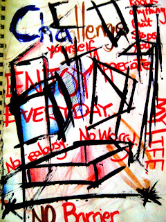
"You Won The Argument, But You Lost The Family"
my manifesto is based on this quote and what i learnt in life and in someway it has changed my personality and the way i think and do things.

 
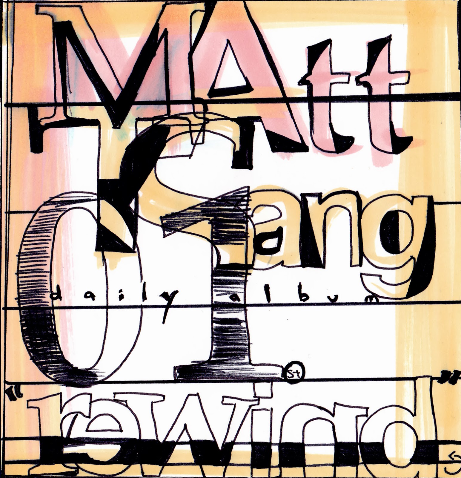
I looked at fonts and different types of way i can do it, the fonts of the final piece i also experimented in illustrator. I looked in books and found artist Claes Oldenburg, although his work is not typography, i was inspired by him and gave me an idea for typography. He creates sculpture that are all ordinary things into massive scale, this gave me an idea of my manifesto to have less important words in a much bigger font and size and more meaningful words to be much smaller.

After, i kind of try to remember my experience and how i adapted into new situations and a different environment.moving from Hong Kong to UK.
Because i want to give a personal view for the readers, i wanted to include my language and the background of mine, i used Cantonese in the beginning to give an idea for the reader.


 After, explaining my ethnic background i experimented different quotes that explained my feelings during 2003 but also thinking of my own positive quotes which can explain what i have learnt from my childhood.

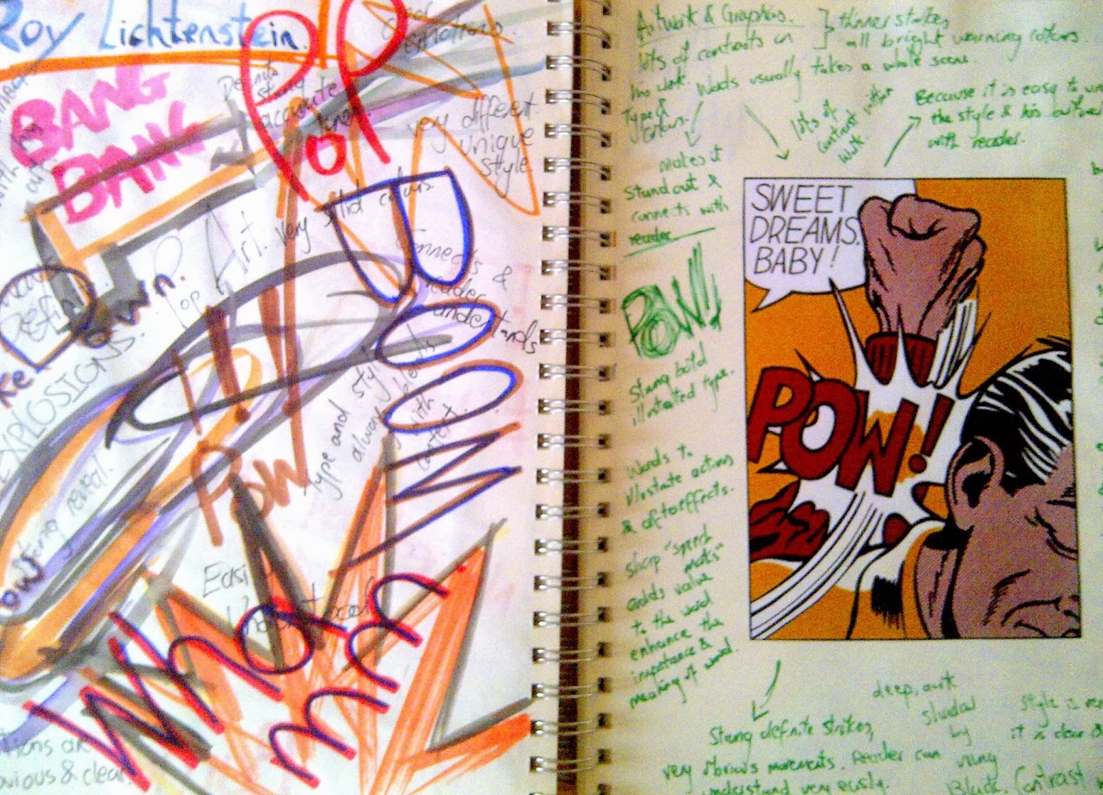
during this process i also looked at more artitst such as Andy Warhol and Roy Lichtestein


I was inspired by the bright coloured and defintie lines from the artists, this gave me the idea of using these bright colours technique to show the positivness after my childhood.

Planning
 

Final Piece


i based the whole page as a time line from 1995 - 2013. in the beginning i wanted to give the reader a quick idea of my background. The family album is empty creates a strangeness for the reader. It says N/A as I don't have any childhood photos or they are missing, i try to create a quick sense of attention for the reader. i used a very unneat handwriting font to represent me as a child, this font continues and creates contrasts with the bold writing in 2003 - 2008.
Because at 2003 is a the twist in my life, i changed the colour, boldness and size to really tell the reader and grab their attention. 
The manifesto goes from black to colour in 2009/2010. The colours represents a much brighter life for me and telling people what i believe in. 


Friday 1 November 2013

Project 2 Day 3

Editing day, as this was very new to me, i could only help the team with creating text and pictures that goes in between the video. However i gave ideas and effects that we can do, as a team we worked well and learnt a lot from each other. I have learnt a lot in Imovie from my teammates, i learnt the basic foundation of this programme, creating effects such as black and white, brightness etc, how to cut duration of a scene, how to link music in the background and to create a time lapse. Everyone had their input and was not ignored, and i think this has led to a very successful film. Having not much experience in making films in our group we have done a very good job in my views.

Here it is !
(if video does not work)
Here's the link ! https://www.youtube.com/watch?v=dzMmxgJYRcc#t=10


Project 2 Day 2

Working in a group was harder than i thought, in situation i feel i have to be more responsible. We sat down as a group and discussed ideas, there were lots of ideas coming out and development coming out but the structure is gone, we began to drift off the story board. Therefore instead of doing inside work, we took it outside and started filming and taking pictures. By doing this we had more of an track, we know the structure of the story better. we also developed while filming, we even deleted scenes and re acted them while we were outside. As a team we worked really well and shared our skills throughout. It was a very natural thing for us to take our jobs, this was unusual for me as before when i did work in a group, the roles of each person always gets disorganised and confused. But we worked very well.
We had 1 person filming, 1 person taking pictures, a director and 3 actors. This whole process worked fluent and were organised.
After filming and taking pictures we were set for editing the next day.


These are some of the raw shots we got, we also filmed while doing this so we can create a timelapse and video effect. The video we filmed was 5minutes long and we took around 500 photos.