Sunday 27 April 2014

Iphone app icon


Developing iphone app icon, adding the title into it as the logo is not clear - keeping the title small and leaving space in the logo for the vibrant type to be the centre of attention. 
Tested different types of fonts and colours and opacity. the black font makes a subtle appearance from the grey background of the icon. this fulfilled my target as i wanted the vibrant part to standout at the same time i want it to be understandable, the title on the corner does the job, its subtle and slanted to give a sign of aut

application


seeing how the logo can apply into different things such as packaging and merchandise. the logo itself can be seen as 4 separate sub logo, making merchandise collectables. i believe this will bring a different side of branding.

The app logo was added a dark grey background to contrast with the bright and vibrant type.
Being a app logo competing with millions of other apps out there, i think it was important to contrast and very clear. the app icon had to be different, i went for clear and spacious feel. i feel lots of app icon uses the space too much and mine does the opposite and seems more calm due to free space. because the logo itself its abstracted it needed that calm space hence it being grey to balance it.

Wednesday 16 April 2014

Design Museum


Another exhibition at the museum, this was more to do with branding, this part really helped me out with making my game as a brand more interesting.

The Whitney company has taught me different way of how the logo can work, it showed us how the logo worked in each application and how it has changed but keeping the identity. It was as if the w lines were moving and seemed bit like motion graphic in a static way.

It was a very unique and an interesting way of branding the company.

there were some character to design on the "dumb way to die" company, which taught me about simplicity and really connecting the user of the target market - something i can think about for my game.

there were more products there that didn't attract me but how it was presented did, the dark room with spot light really bought out the product, it just stood out - it was like a spot light for the product like someone found on stage. It gave a sign of target, a sign of importance to the product in the atmosphere - in a way it adds value to the product, maybe this can be done with characters - expressing them as fine art piece instead of a toy.

The smiley and the door gave me an idea of realism vs frictional matter, this is interesting as i can develop my characters with a realistic war scene maybe ? for advertisement as a post or a set of photograpahy. converting the 3D to 2D

Design Museum - Paul Smith exhibition


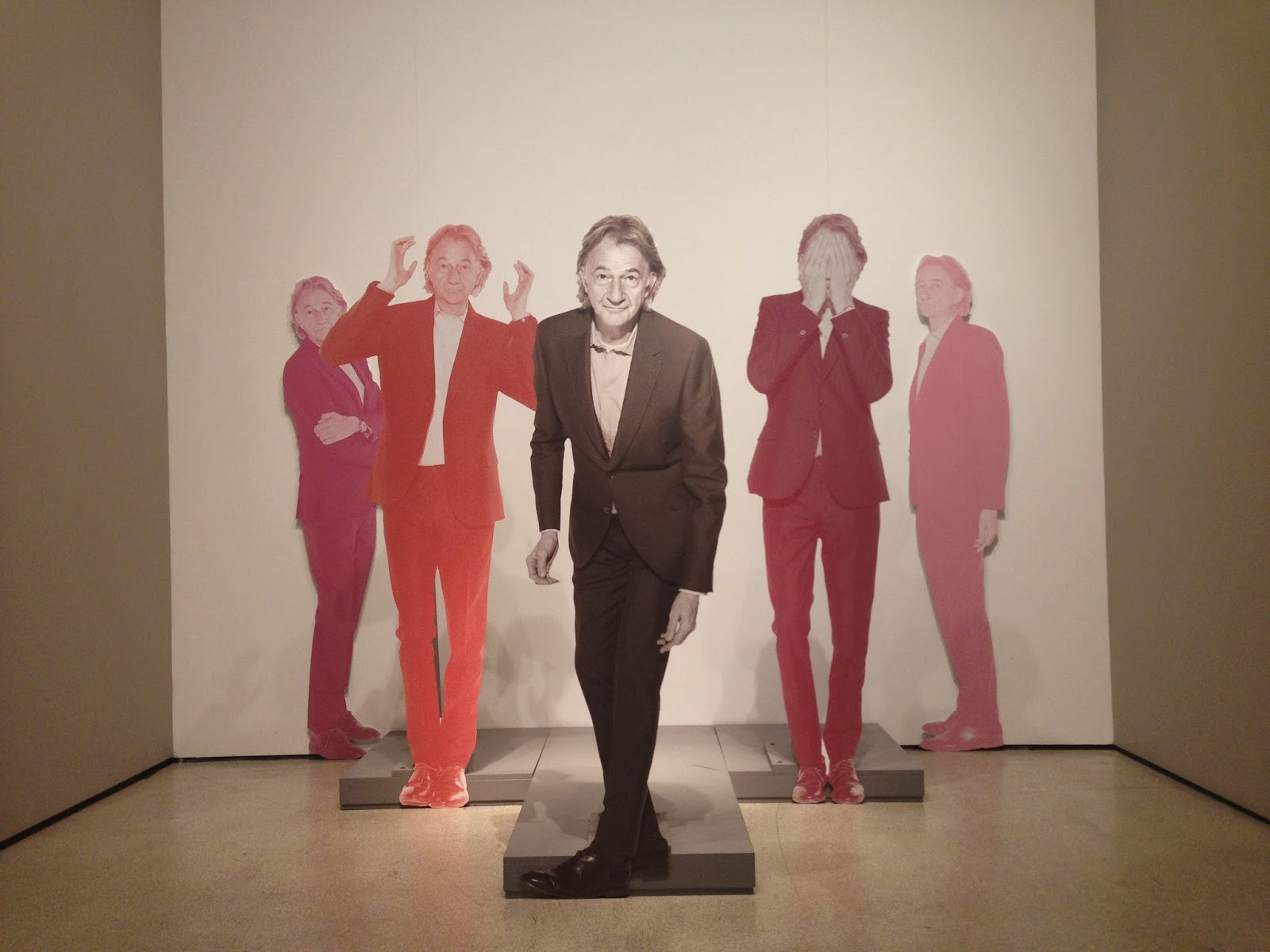
Paul Smith exhibition was such an inspirational visit for me, the way the way the art and fashion was presented was different to others and i found it more effective, it was one of the most interesting one i have been to.

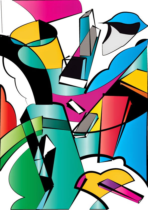
Paul Smith really liked the colours from his work and colours is such a big thing to him, i relate to this too, my work is really coloured base and he grew my understanding of colour much further, in the exhibition in taught me control, and sharpness. "Colours can be colourssss and it could be c o l o u r" this was one of the quote in the exhibition he said. he meant colours can be very vibrant and wild but at the same time subtle light solid colour can work very well and stand out from the crowd too.

The recorded speech that was at the exhibition was very inspiration for me, maybe becasue i like and really base my work round colours too.

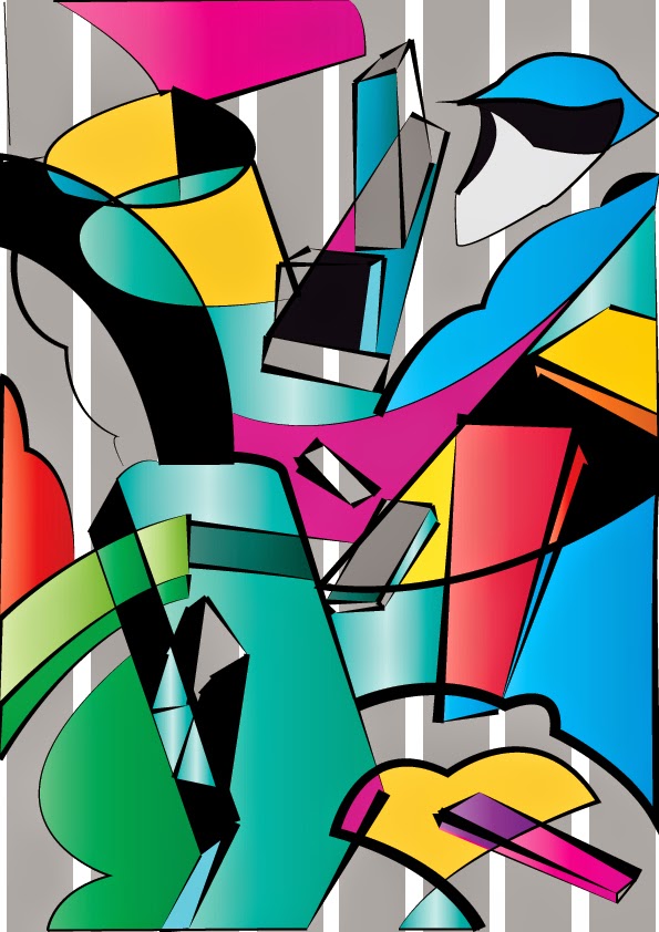
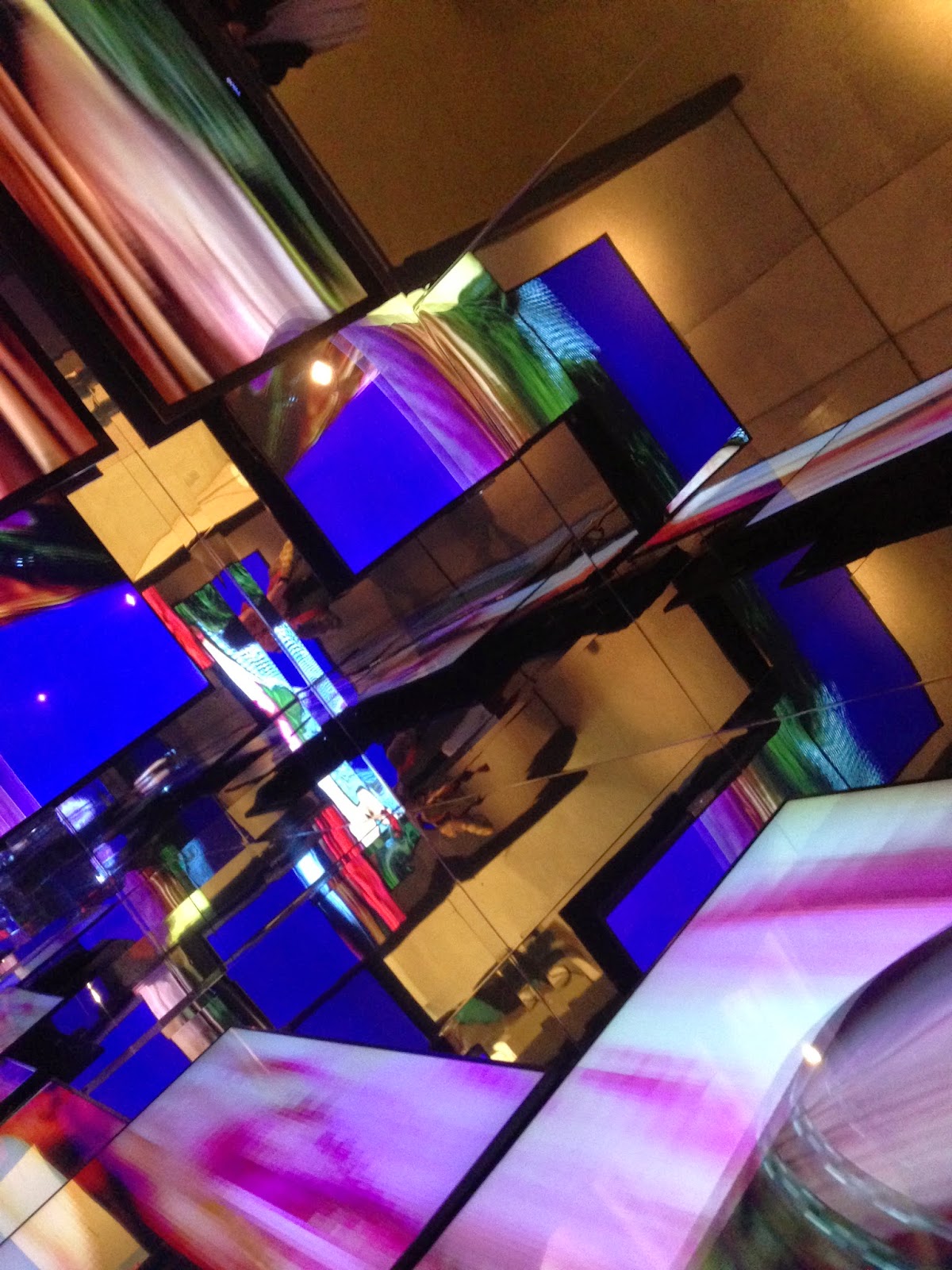
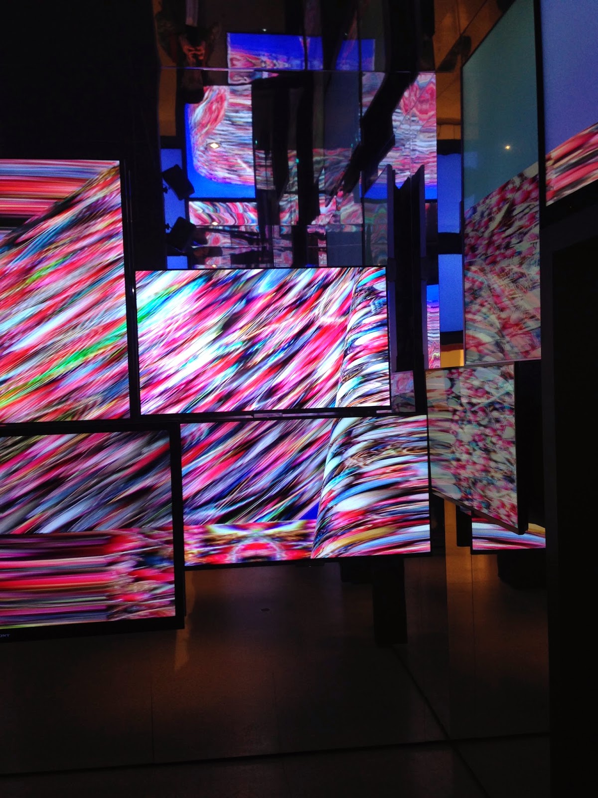
there were lots of his art framed on walls, there were definitely many colours and patterns which inspired me for my game - maybe the shapes of bullets in the game ?. I was most fascinated about the room with all mirrors and the tv acting as canvas - but f=digital and moving images. the room looked infinity with his bright colour designs, it was an amazing room.

It definitely inspired me and made me think how do i present my work at my exhibition m characters and my art, could i use mirrors, could i use canvas, thick card but slight away from the wall to create shadow ?

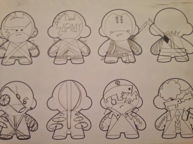
"printing things in e=unexpected colour, printing the unexpected on fabric" this was recorded and played in the room, which helped me think of my character design and i would like to base it on this quote. not all 100% based on it but some part and some elements of it.

Saturday 12 April 2014

AVMO logo


Developing characters


This is the type of character i want to develop, based on illustration and not really eyes nose mouth and showing what it really is, i want the character not to be very straight forward charter, i want to express them in a different way and using my illustration in a different way and showing people art and in different way.

eg i showed graphic design in a different way by using them as design on a t-shirts and sweatshirts and creating a clothing brand. All about expressing art in different way then paper and canvas media.

Collaboration with Lens base media


collab week with lens based media student, because i was about to design characters for my game so we made a character out of the things that we were given.

because of the limited things, we changed the topic away from my game and did a character and a moral story for children

This week has developed me in thinking making physical characters for my game, i can apply my illustration on a shape of a character and not on paper - expressing my artwork in a different way.


In the style of Kaws the artist, i was fascinated by the colours and the shape the artist has developed and put together in a piece of work, there is just something about the shapes and colour in his style that makes originally shape and colours very interesting and the composition definitely plays a part.

this piece was done by me inspired by his style, i don't think this was successful i think the black outline has lowered the quality of the final piece, i think the piece is too defined and definite/safe. i can try and develop this and changing the outlines to the colour and a different colour to black.