Monday 20 January 2014

Data translation Final Piece


I used blue and red to represent each city mainly on the basis of their flags. I promoted the aim of the poster at the bottom with a different colour writing, brown representing negative and fail, but the green writing gradually gets greener and greener. I did this on purpose as we want the world to be more green in the future. 

In this project, i learnt that how literally anything can give you an idea, i got all this idea from the data naturally giving me in the units "ton". I think in order to show the population and the size of each city could have been more interesting rather than just stating in just type. Maybe i could have linked in my circle ratio idea with this piece. 

Data translation


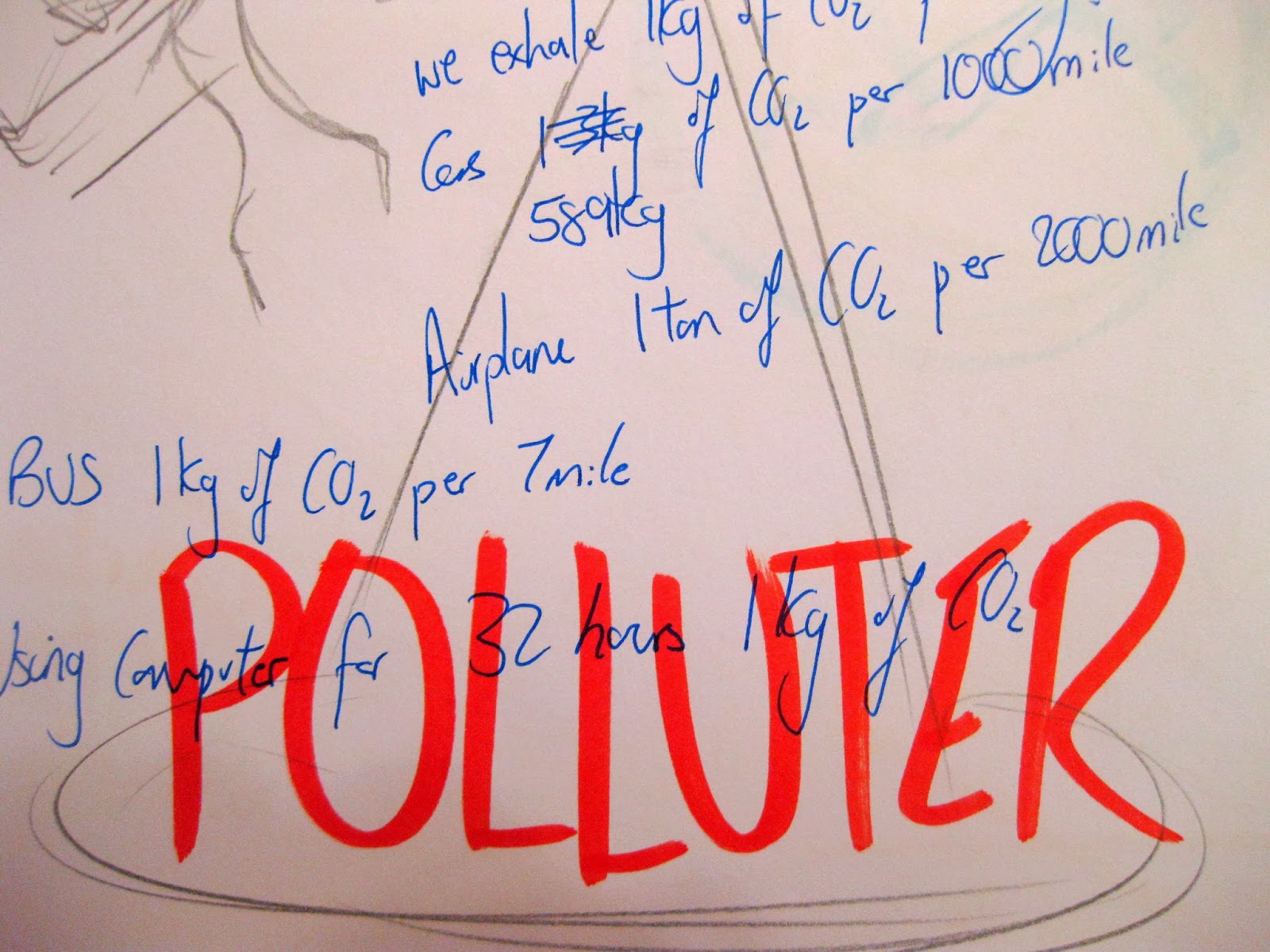
My data was about the car emission of CO2 affecting global warming, i wanted people to understand how much CO2 we are producing every day, every hour, or every minute. I want to influence others to stop or minimise their usage of cars. To this i wanted to show an example and concentrated on the figure of the weight of CO2 we are producing.
I began to collect data and working it out for myself, i concentrated on a city London a very car populated city, it worked out that we produce 541 ton of CO2 in just 15 minutes ... the data was in a ton and this gave me an idea.
we all know elephants are a very heavy animal and most probably know its one of the heaviest animal on earth, i want to use this comparison to indicate to properly how much CO2 we are producing.
After planning it out, i thought the data was telling enough, it was really giving people an understanding of how much CO2 that is and it doesn't really indicate whether it is bad or not bad.

 so i compared another city with London to let people see the difference. i picked Hong Kong as it is a similar city in terms of size and population. Hong Kong's CO2 pollution from cars is much smaller than London, because now i have compared people understand and get the idea more.

Before using the elephant idea i came out with the idea of using circles to represent the size of the city and another circle of car population and CO2 pollution, this way people can see the size of the circles and see how London produce way more CO2 then Hong Kong.

i stuck with the elephant idea, as it was more unusual, a different way of representing CO2 data, it may grabs peoples attention more. i worked out the weight of CO2 produced in 15mins and that equivalent to how many elephants.

Working around with layouts and different ways of presenting this data.

Saturday 11 January 2014

Final touch to Elastoplast advert


made the giraffe even longer to exaggerate the selling point, the branding logo is now less awkward in terms of size and positioning. 

Final piece


This piece is nearly at A1 size. the size also plays a apart in being different yet simple. 

Wayfinding and Mapping project.


At first i looked at different types of maps, maps in maths, scientific maps, theme park maps, directional maps etc. i discovered each type of map has it own way to represent something and to tell us something in many different ways, for example in a theme park map, people find their through not by looking what road they are on but where the attractions are.
i was in Hong Kong in Christmas so i wanted to show something based on that, my first idea was based on a very easy straight forward map which indicate how many minutes the walk is by colour - i came up with this idea as the roads and streets in HK was very confusing and there were so many of them, so by telling people how long the walk is they can judge their direction more easily.
Then i tried something different,the idea was a map to show HK's economy more leaning towards the mathematical idea of a map. using colour again to show the positive or the negativeness of the economy.
I wanted to show more than 1 place, and soon developed my idea to show the ratio between continents. the initial idea was to show them in term of human size eg the height of them can represent the size of the country and the fatness of the human can represent ration. But during the development, i thought just plain squares is even more effective because the final piece looks overly simple but yet rather meaningful. it is not confusing and very straight forward, because its so simple but attractive it grabs readers attention.


Brand guidelines


logo


application


kerning


elastoplast project : sketchbook work


At first my ideas lead to me creating a elasotoplast "hero" i came up with this idea because its is for the unpredicted accidents which relates to children. therefore i wanted to some sort of children theme to this advert.

i came up with the idea of using the shape of the plaster and the colour of the elastoplast branding to create a character, at first it was working however the more i developed it the more it didn't work, it seemed difficult to really sell the new product - 1 metre long plaster.i tried to represent this idea on the hero - it being having a very long cape made out of plaster. this didn't seem to work and could be hard to understand.

still staying with the character idea, i went away from the hero idea and tried just a character wrapped in a roll of plaster - selling this new product. it looked like one of the characters from "mr men."

it seemed to be that i was making the idea too complicated, i wanted something to connect with people and easy to understand and very memorable. this made me come up with the first idea of having a comparison of a deliberate stretched plaster and a normal plaster. i liked this idea and took it forward, i then began of thinking to compare against other objects and came up with a giraffe !


Monday 6 January 2014

Elastoplast project. Final piece

Elastoplast has a new product out which comes 1 metre long, for the unpredicted accidents.
This is what i have came up with. 

I went with the comparison concept so eg. 

After creating this piece, it lead me to another idea - to take it to the next level and take the comparison to more extreme.
This is my final piece, it is not as obvious, but the image and poster stays in the readers head as it is odd, having something which seems really irrelevant to the product it is selling. But because of this point people will remember this poster.


Having done this project, i learned how poster can be very simple and effective at the same time. i used the comparison of an animal to represent the selling point of the plaster. readers can connect and understand it straight away when it is simple but this poster i made can be misleading. as the animal does not have any relations with plasters. but because there is humour behind the poster i think this is what makes the advert memorable, and people will remember a new product from elastoplast. 

Friday 3 January 2014

A2 presentation


Logo for street food brand


Branding Project - sketchbook notes.


looking at style and relating the brand to the type of food. Research a little bit on the actual food itself.


Developing the shape of the stand, and function, also looking into packaging and colour scheme.


experimenting with typography and seeing which type blends well with the brand, and how type can affect the image of the brand. Starting to apply logo etc on application such as aprons. designing new style for the staff wear etc.