

Researching on this topic.
Seeing examples of what can be done to logos and slogans.
Some were very cleverly done, the most important thing i have learned here in research is that keeping the font, colour of a brand is very important otherwise readers would not connect with the original branding.
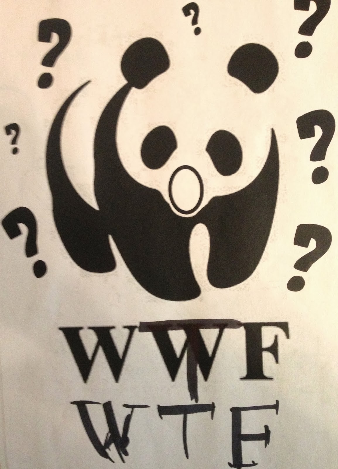
WWF chartiy i changed to a slang word teenage people use usually over texting, changing the shape of the panda's mouth, i think this connects well with the audience as teens understands straight away. it is simple and fun.
Research example Mc diabetes from Mcdonalds - although there is a humour side of all these edits. There are some message and can be meaningful in some way. Take the macdonalds one for example, we all know it is a fast food very popular however we also do know that it is very unhealthy, and changing the logo to McDiabetes gives a very important message to us, As well as humour there is message.
There are some creation just for the humour eg YOSHI ISLAND on the right, with Jurassic park themed.
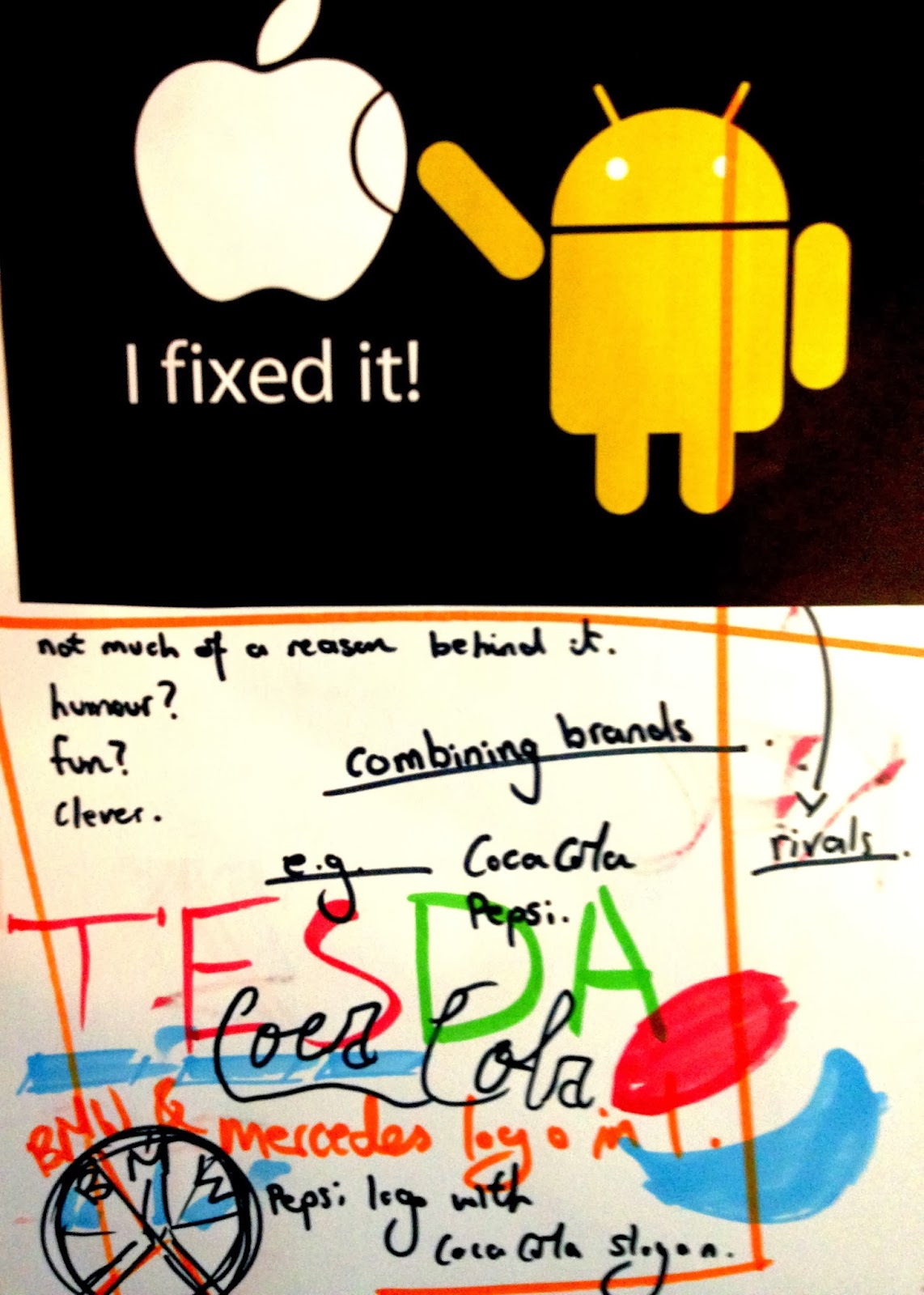
Combining brands the android and the apple logo,as we know they are rival company, and people can connet that straight away it is simple, easy to understand. this make it funny as reader can connect.

Final piece, i decided to concentrate on the humour for this project, i researched into many big companies and try to lower their quality, eg HSBC turned into "worlds local thieve" instead of worlds local bank", another exmaple BT the Internet provider, i turned it to BIT TORRENT. and many more
My initial idea for this Lamborghini one is to replace the bull a very powerful animal to a very childish cow, the humour behind is that, having a very strong powerful striking car on a poster the badge takes away the idea of a powerful car.
further development, i recognised Lamborghini has the word LAMB in it, this i though could bring more humour to the audience. I kept the lamb in the logo very childish as it opposes to a very powerful car.
.JPG)
.JPG)
.JPG)


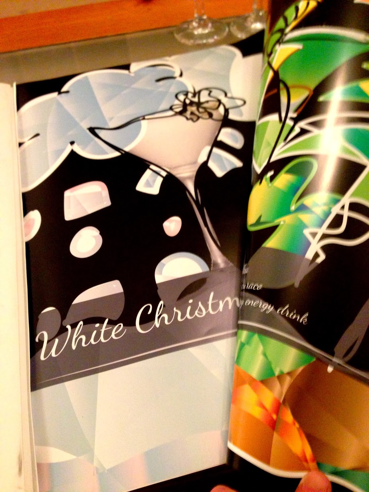


