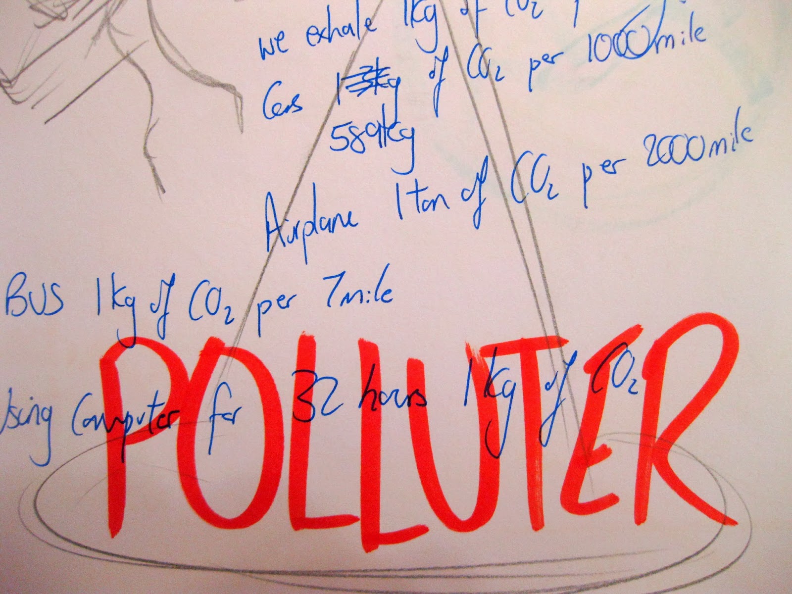


My data was about the car emission of CO2 affecting global warming, i wanted people to understand how much CO2 we are producing every day, every hour, or every minute. I want to influence others to stop or minimise their usage of cars. To this i wanted to show an example and concentrated on the figure of the weight of CO2 we are producing.
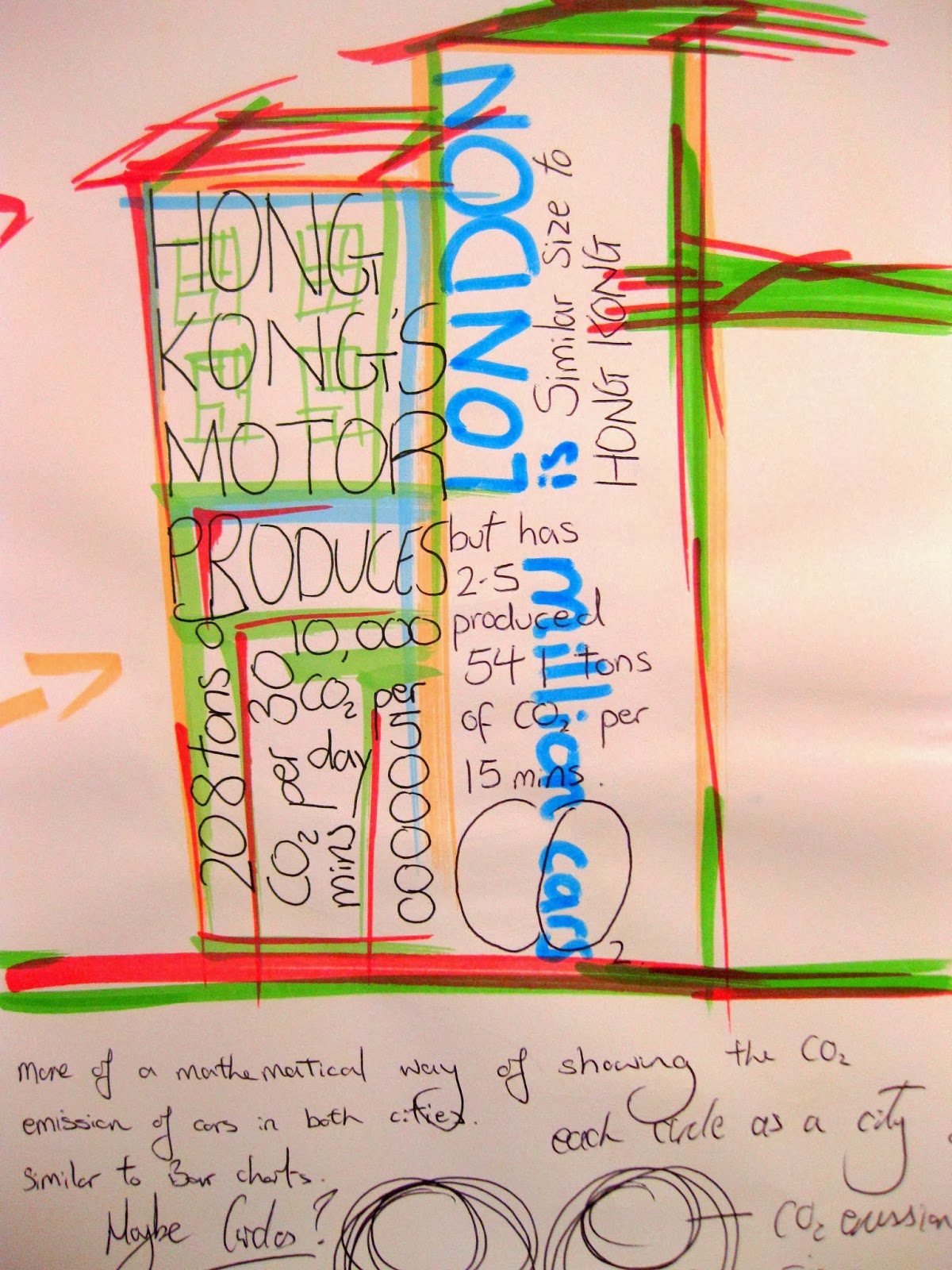
I began to collect data and working it out for myself, i concentrated on a city London a very car populated city, it worked out that we produce 541 ton of CO2 in just 15 minutes ... the data was in a ton and this gave me an idea.
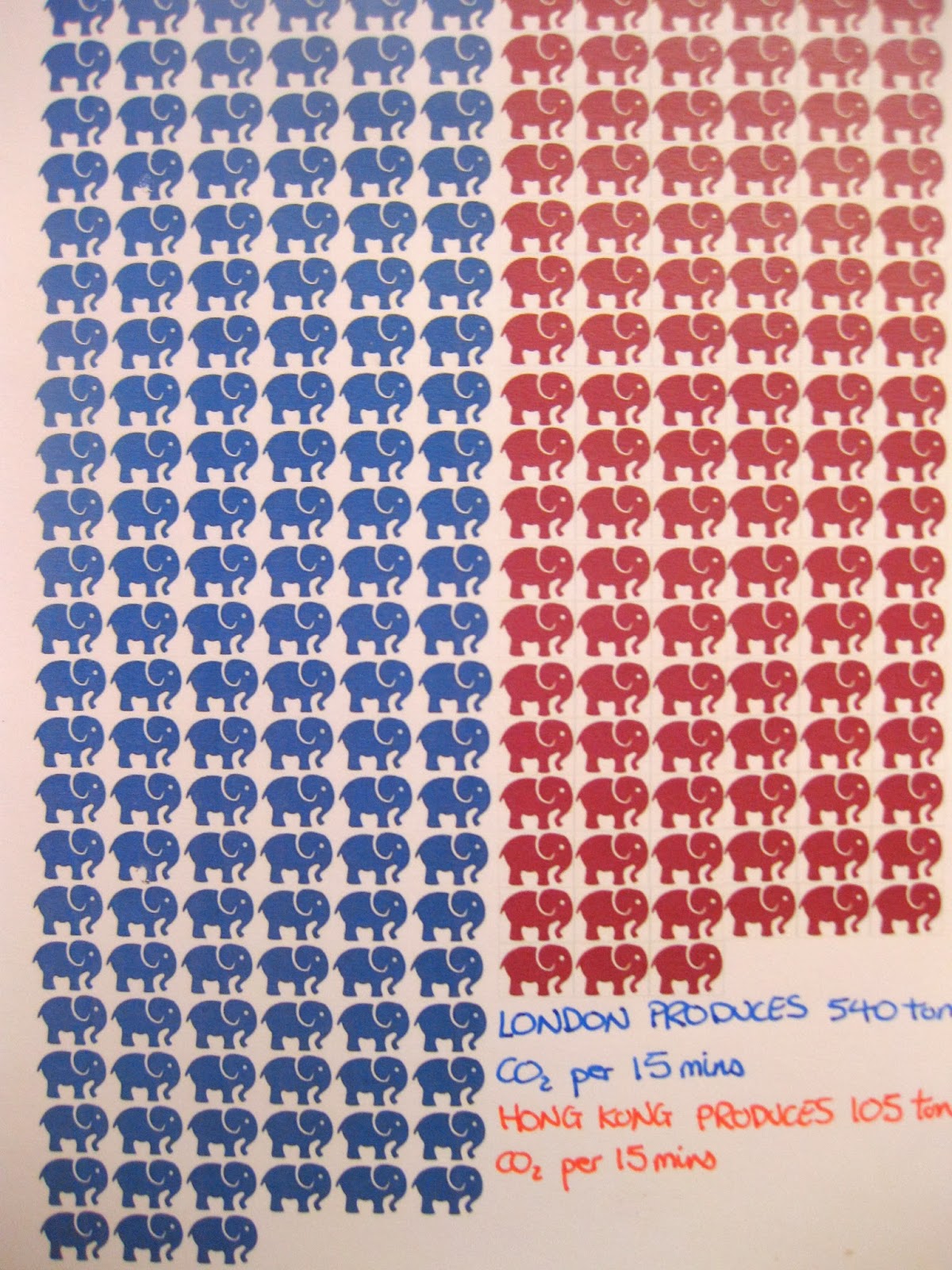
we all know elephants are a very heavy animal and most probably know its one of the heaviest animal on earth, i want to use this comparison to indicate to properly how much CO2 we are producing.
After planning it out, i thought the data was telling enough, it was really giving people an understanding of how much CO2 that is and it doesn't really indicate whether it is bad or not bad.
 so i compared another city with London to let people see the difference. i picked Hong Kong as it is a similar city in terms of size and population. Hong Kong's CO2 pollution from cars is much smaller than London, because now i have compared people understand and get the idea more.
 Before using the elephant idea i came out with the idea of using circles to represent the size of the city and another circle of car population and CO2 pollution, this way people can see the size of the circles and see how London produce way more CO2 then Hong Kong.
 i stuck with the elephant idea, as it was more unusual, a different way of representing CO2 data, it may grabs peoples attention more. i worked out the weight of CO2 produced in 15mins and that equivalent to how many elephants.
Working around with layouts and different ways of presenting this data.


No comments:
Post a Comment