Saturday, 12 April 2014

Artists link


Having looked into different ways of developing a character, while looking at artists such as Huck Gee, reading their intersts on their blog, Huck Gee and Jon burgerman show us what kind other artists they get inspiation from and which work they like in particularly.

Because i have interest in Jon burgermans work i researched into the artist that he gets inspiration from, i was excited to see how many ways illustration can be done and how they can look using different effects or technique.

These were the artist that grab my attention - Tim Biskup, Takashi Murakami, Rik Oostenbroek, Kaws, Nathan Jurevicus

Having researched them, they made me realise that things can be done so man different ways and each illustrator really have their own style even things look similar you can till tell the difference.

I want to make my characters in my own style and try something different.

i particularly like Tim Biskup style on the left.  angular shapes and using different colours and shades of colour to define areas, using this way to make the definition.

I like how busy the work of Takashi Murakami yet we can see what it is, sometimes abstraction can lead to the loss of meaning, however here i can i see what the product is within such complexity and abstraction.


Types of physical characters


Having seen many types of characters out there visiting london etc, i concentrated one of these 2 types, square box and munny characters.

These types of character can help me develop my graphics skills applying my illustration skills onto a character instead of paper. it is different to what i usually do.

having seen these designs, they inspired me to do my own for the game. I want to show my illustration skills in a different way.

Natural history museum and Science museum


Visiting the museum in London for inspiration for characters and the game.

the natural history museum was not how i expected it to be, the products that were there did not relate and was difficult to relate, however having seen all these animals made me think the army in my game can have some relations, relating the to Chinese Kung fu cultural - they have the monkey, tiger etc. this can exist in my game - this can lead me to doing some character with animals.

Science museum was better in relating to my game, the mechanical part is see can exsist in my character's weapon, the shapes of planes made me re think about weapons and the way character looks. i learnt more about micro - organism how they look under the microscope and their shapes. some micro- organism looks like they have a face which can developed into a character. The technology that was shown at the museum such as 3D printers and futuristic lighting inspired how things can look in my advertising posters.

The idea of 3D printers showed me what it can do, it increased my knowledge of those printers and how they can produce figure straight off, there were some characters made in display at the museum - more like monster can relate to my micro-organism idea.

More book - characters for mobile devices

Having looked in the logo book, it made me looking into the history of games at the library, i looked at the history of famous characters like pac man and mario.


 Mario was called the "jumpman" its appearance was pixelated and that was its character and style, similar to pa man, of course the technology was not as advanced as now but i think this is something that is a history and the style of vintage.
we now have technology and develop games to be very realistic, but i think the whole point of games is that its meant to be different to the real world almost like a different world. fantasy etc.

toys made in the old days from the Mario game, they look they are suited to the game due to the puzzle like adapting to the pixelated style, the application can become collectables. Gamers find them interesting i think because its bringing  something to reality that are not. we don't see what exists in games everyday in  life so to produce something that are meant to only in games is unique and different. 

Huck Gee artist


Before developing the characters for my design i looked at certain artist that I'm interested in developing the style of my characters.

The illustration by Huck Gee grabbed my attention the most, this lead me in thinking to develop an advertising work piece. I want to do something different for my adverts for this game. these illustration by Huck Gee can work as posters on itself, as a piece of art. using the street as a gallery. This is an area that i can look into to advertise my game.

AVMO logo


Developed logo, sketched and scanned it and worked on with illustrator,  trying different colours and shapes and opacity, (more working in sketchbook)
trying to enhance the idea of war and army with little monsters - micro - organism using colour.

army - concentrated on the camouflage and micro -organism the bright colours that are seen under the microscope.

looking back into science books and seeing their shapes. using inspired ideas from logo book, the block letter and shapes combining the both. based on the letter AVMO but the letter are enclosed as letters.

LOGO book by Michael Evamy


Having visited the library and looked up this book, i learnt more about the importance of logos and how they can affect a brand. i learnt how different types of typography and shapes can affect how customers view the company.

signature type can increase the feeling of trust and shapes like square/box are usually used by banks due to it suggesting stability and security

Having seen many different types of logo from this book i particularly found shapes and lettering suiting to my game. something like the logo "BAD" on the image on the left.

This was a very useful book and developed helped me develop my logo.

Tuesday, 25 March 2014

Visiting London - comic stores and model shop

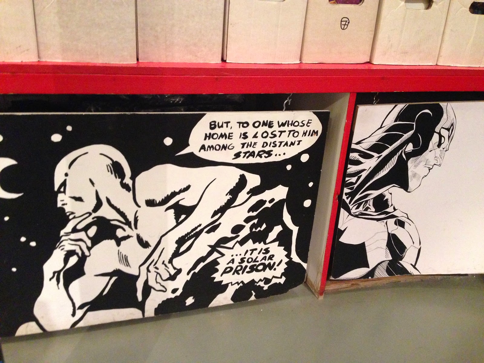
Visiting lots of different comic stores and model shop gave me many different ideas of what can be developed in my game, although i don't want my game to be the comic style it was interesting to see how comics worked and see if the style can inspire me and improve my gaming project.

it was very interesting to see the amount of different models there were, i saw realistic models as well as vinyl toys and paper models which all have their own style and idea.
It led me to wanting to do my own for my game.


seeing how brands advertise in stores - selling t-shirts in a square box is different and very straight forward with the brand.

having spend the day in London, it inspired me many different ideas and media to create a brand. an interesting media i spotted was the use of light as a colour and the characters being blacked out, it seemed like a shadow and lighting played a strong part of the object.


I also noticed that merchandise and creating models from the game e.g a certain weapon in the game attracts customers and gamers. I think this is due to the realism that is brought from the game - because a game always seem to imaginative and non existent in the real world, by creating something that exist in game to a real life object creates a sense of surprise and these merchandise can become valuable collectables for the gamer.

Monday, 24 March 2014

Final major project - Logo

when looking into popular gaming apps - i have noticed that the names of the games are very straight forward, they are really self explanatory. eg plant vs zombies is literally plant vs zombies.

i decided my game to be army soldiers vs bacteria who is try to take over the world. the genre of the game will be very similar to plants vs zombies.

the name was difficult as it it had to be kept simple and straight forward but at the same time it has to tell what the games about without it being too long. i wanted it to be short and snappy.

i came up with the name "AVMO" it stands for army vs micro-organisms and civil war as a small slogan.


sketchbook work of developing the logo, experimenting with logo shapes and type. using different media to see different effects, trying to go into 3D and back to 2D, inspiration from artist Rik Ooestrobroek, a graphic design/illustrator  using colour and swirls to form very crisp, intricate shapes, type and art.

inspiration also from MTV motion graphics advert branding, the sharp bold structures, and angular shapes relates to the type of my logo.

Experimenting with illustrator program - looking into more details, the shapes and shades of colour to the opacity of certain parts of my logo. Using the functions and the technology of the program to enhance my logo. Afterwards seeing how the logo works with reality - application such as on tablets, iphones and into the itunes app store for example.