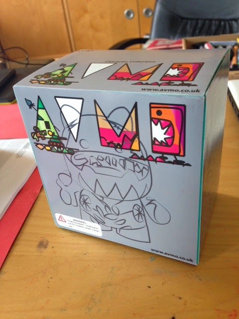
However i thought the logo has appeared many times on the application part already, so for the packaging i wanted to go for something more related to the character.
 i chose the colour as the main key. My characters all have their own individual colour. i made this appear in the packaging. for example, the Cannon character is grey, and for the packaging i used different shades of grey for each side of the box.
the model i wanted to keep to a mystery at an extent, so i only gave the outline of the model on the packaging as a clue to what the model is like.
Using layers in illustrator, to give a sense of composition and overlap, on the sides of the box, i used opacity to 10% in the background of the outlined character, i wanted the repetition because of the army idea.
i think the packaging has worked well, it achieved my targets
- sets a good impression
- has clue to which character is inside
- a sense of advertising - websites and logo.


No comments:
Post a Comment