This week has been one of the most enjoyable week for me, lots of topics and task suited my style and how i do art/design. From the first day i enjoyed the mark making we did, and out of just normal random mark making we turned them into something that had a meaning, such as typography. I realized how mark making can have its own style, e.g drawing figures with the non dominant hand or drawing with our eyes closed. The figures actually turned out to have its own unique style.
I learnt how graphics can connect into lots of other pathways and industries. Graphics design is needed in so many places such as packaging, advertising, posters etc. it can work with photographers, fashion too.
I learnt the variety of media that can be used, the computer generated styles like semi-gloss paper, Matt printing. Also using programs such as illustrator, Photoshop which i still yet to learn.
I experimented with wide range of colours, range of media including graphic tablets and types of paper. It was very different to what i have done before.
At the end of this week, my view on graphic design changed a little from what i expected, Graphic design have some elements of fine art too, and the amount of stages a piece of work can go through and be process till it being the final and polish final piece can take a long time. At the same time the process can be rather short. Another thing i learnt is that sometimes you have to fit the aim of the job, sometimes your designs may have to change due to the specification of the task. Meeting deadlines is something i learnt too, that they can be very short and being organised is important in the design industry.
Monday, 7 October 2013
Saturday, 5 October 2013
Week 5 Day 3
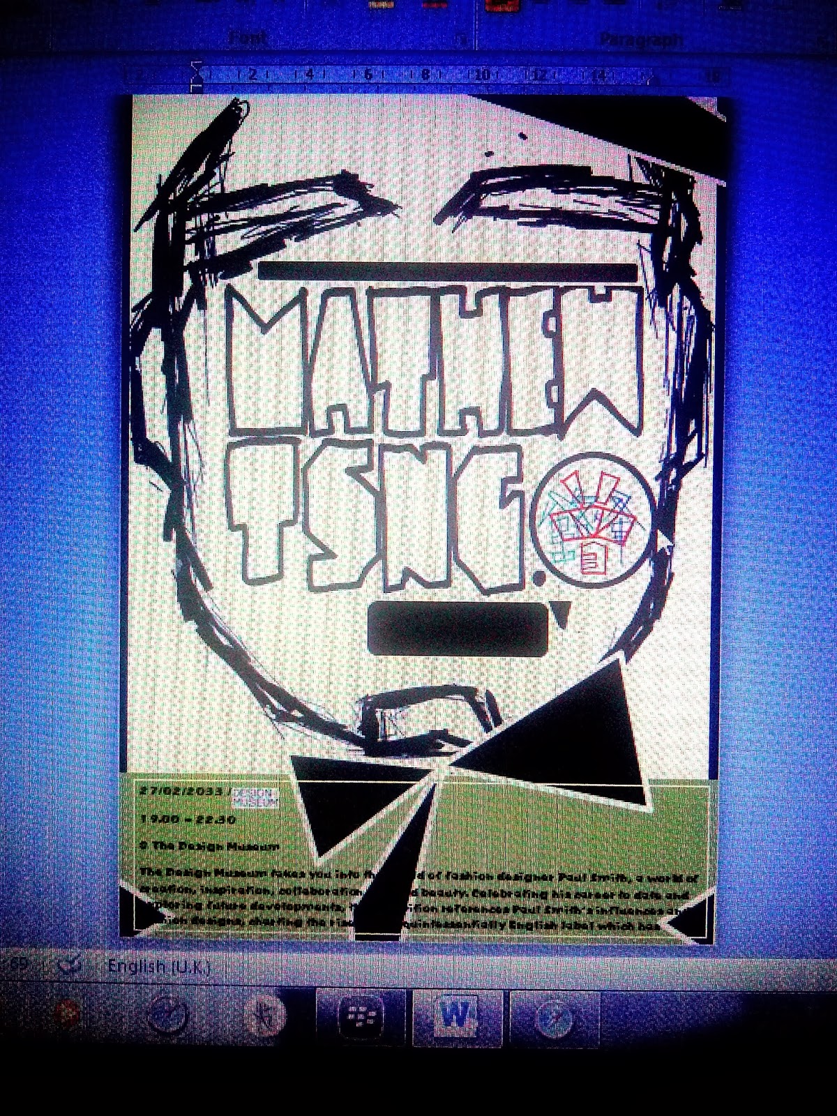
Today the task was to complete our posters, The tutor consolidated the principle of there are no rights and wrong, and sometime strange things can have a good effect on the poster. Also try not to do the norm as it wont stand out from the crowd. The poster is set in 30 years time, it will be rather futuristic, it is also for a piece of work that i been famous for. I chose the fashion costume i made few weeks ago as my exhibit piece. I wanted there to be a connection between the style i worked in and on the advertising poster.
I wanted to be famous for the angular and straight edges, creating striking and pointy art and designs, so i reflect this idea on my poster.
After experimenting with ideas and composition i came up with this idea, drawing the outline of my face but in a angular way to make a connection with my work i am exhibiting.


sketchbook work, and hand drawing face outline, afterwards i scanned this work into the computer and starting adding more angular parts, using a grpahic tablet as a media, trying out different strokes and colours i came out with this idea. After playing around with colours and layout i still think the poster is lacking something, it is not striking enough it can be more optimistic and more striking. therefore i changed the colour scheme to a much more contrasting one and creating the face to be even more angular and sharp to represent my work.
After the first print, i had more time to do a second. This time i wanted to use a different media, I used just watercolour and my logo enlarge on the face, this piece is less obvious who the exhibit is about and is more abstract and harder to understand. however the emotion on the new poster is more clear. it is a straight face with no facial expression. This was done on the 2 poster deliberately because as well as showing the angular costume that is in the exhibition, i want to tell the reader that when i do art or design the work represents my emotions and what i am trying to express, for me sometimes there are a mixture of emotions, i try and let the work that i do to view my feelings. This is shown by the unseen flat facial expression on the poster.

Pictures, All author's own.
Thursday, 3 October 2013
Using existing typography from books to create this
I overlapped the words and played with scale, it created a busy but rather intricate piece. i chose around 5 different types of writing, considering about the shapes whether is round or straight edged, it creates the contrast between the words. i extended some of the words out of the size of the square which we are meant to work in, i did this to try and be different, also to show the contrasting scale. For some letters i didn't extend it out of the square becasue i didnt want it to be too busy that the view cannot read the writing.


Using these 5 fonts i chosen i created this. ^


Using these 5 fonts i chosen i created this. ^
The fonts were by 1) Slawek Michalt
2) David Catalan
3) Unknow artist
4) Bunch studio
5) Gill Sans Bold
Wednesday, 2 October 2013
Week 5 Day 2 Typography
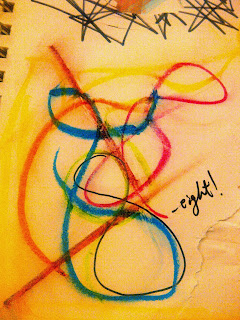
Today we started off with a lot of experimentation in my sketchbook, exploring different ways of mark makings, seeing what i can do with different media and see what effects it can create. i came up with 8 ways, first by holding more than 1 pen and only using circulation as a movement - this made the colours overlap multiple times creating a slight 3D effect.
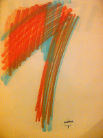
2) sliding the pen to create marks, flicking the pen on paper creates a wide stroke then gradually thinner. In my point of view it creates a sense of movement.
3) the use of markers and overlaying colours on top of each other to see the strokes made different from each colour. This stood out due to the wide range of colours and obvious strokes.
4) Use of charcoal made the writing less present, more vintage. I used the physical side as the main media , using the charcoal on its side and tip to create the contrast of wide and narrow.
5) while using the charcoal, some of it was left on my fingers, i then started to use this to create prints and control direction of the strokes using my fingers.
6) oil pastels and smudge
7) using a knife to cut the fonts, playing with negative spaces.
8) Pencil shaving and glue to form the word, the texture of dust and lead.
1,5,6 2,3,4,8


Pictures - All author's own
Other ways which i thought i could also do to make interesting marks are :
Remotew control car and paint
pva + paint
Air gun to explode the ink or paint on paper
creating strokes with hands
wrapping a football with paper and play.
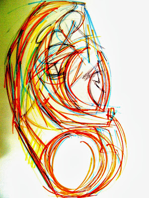
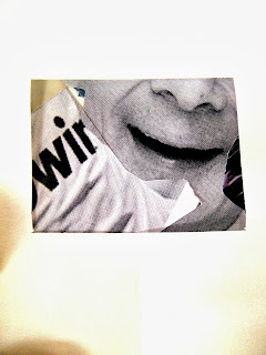
Drawing of close up and using the viewfinder
 |
Media used, markers, pencil, pens, colouring pencils. I turn the close up capture to a more angular and straight edged to try out a different effect. The most stand out part of this piece is the face on the top right hand side, i think this is due to the scale and the only redness on the page. Picture, All author's own |
Monday, 30 September 2013
Week 5 Day 1 Graphics
Today i learnt that graphics can start from a very simple drawing, and be developed numerous times, the process to the final piece can go on and on and on, going from drawing on paper, scanning to be drawn on computer to printing etc.
Also, i realised how most people think that a drawing that's the most identical to the original is the best drawing, this is not the fact, there are lots of styles we do things in and we purposely change the effects and way we draw it in order to stand out.
I have drawn and practised drawing with my non dominant hand and continuous line drawing before, however i have not tried drawing with the pen in my mouth, and never drew something quite small to a much larger size e.g an ear. It was a good experiment day.
As well as this, i learnt a little bit about the business side - that client may always change their mind and deadline can sometimes be very urgent. to overcome the problem is to send the client an e-mail confirming their brief at the start in order to make the project easier and more organised.
Using charcoal, markers, graphite pens, biro with different ways of physically drawing it. I drew a figure with pen with my mouth, with my eyes closed, using non dominant hand and continuous drawing.
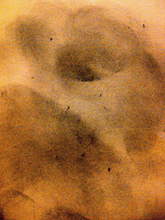
an ear on A1 size piece of paper, doing larger scale suited me well as i am use to big sketch books. By doing things in much larger scale i find it more expressive and more detailed when the picture is then minimised to the smaller scale.
I tried making the ear more phiysical, different and the corners more critical and sharp to create a different feel as we always see an ear round and soft.
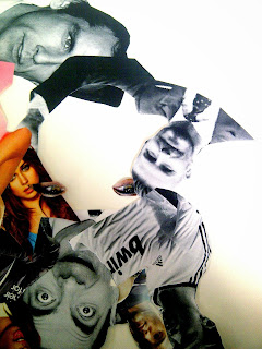
I then made a collage to form a face, i concentrated on the outside shape of a face first and then going into facial feaatres and shadow darker areas on the face.
In surprise during the collaging i used the negative space in the background and created some bird or chicken alike feature.
< (the beak and the eyes as the feet)

Also, i realised how most people think that a drawing that's the most identical to the original is the best drawing, this is not the fact, there are lots of styles we do things in and we purposely change the effects and way we draw it in order to stand out.
I have drawn and practised drawing with my non dominant hand and continuous line drawing before, however i have not tried drawing with the pen in my mouth, and never drew something quite small to a much larger size e.g an ear. It was a good experiment day.
As well as this, i learnt a little bit about the business side - that client may always change their mind and deadline can sometimes be very urgent. to overcome the problem is to send the client an e-mail confirming their brief at the start in order to make the project easier and more organised.


Using charcoal, markers, graphite pens, biro with different ways of physically drawing it. I drew a figure with pen with my mouth, with my eyes closed, using non dominant hand and continuous drawing.

an ear on A1 size piece of paper, doing larger scale suited me well as i am use to big sketch books. By doing things in much larger scale i find it more expressive and more detailed when the picture is then minimised to the smaller scale.
I tried making the ear more phiysical, different and the corners more critical and sharp to create a different feel as we always see an ear round and soft.


I then made a collage to form a face, i concentrated on the outside shape of a face first and then going into facial feaatres and shadow darker areas on the face.
In surprise during the collaging i used the negative space in the background and created some bird or chicken alike feature.
< (the beak and the eyes as the feet)


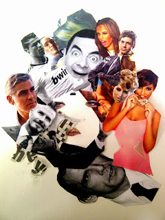
using a view finder to capture intersting parts. here i capture emotions, and facial expressins whihc contrastes eachother as well as colour.
Pictures : All author's own
Sunday, 29 September 2013
Kemistry gallery at Old Street
 |
| I love this title due to the amount of contrast going on. The scale, texture and colours varies a lot but at the same time it is kept moderate so that the viewer can read it. |
 |
| Unknown artist, I like the technical and this kind of breaks the barriers a little bit, The lines and curves make it unique, obviously an owl are not shaped this way, this is way it makes it different and rather surreal. The use of lines are thoughtful too for example the heart beat and pulse. |
 |
| This is i like the fragile and delicate feel of it, it is very soft and lightly coloured nearly fading away from us. |
 |
| Seymour Chwast & Milton Glaser. I like how the words stand out, the facial definition is very strong here by the white coloured lines, the words stand out due to colour contrast and they all seem to be related to design and business. |
 |
| Old street had lots of design offices and nice unique boutiques, this was one of the door front of a graphic printing company, the range of typography, it sets a positive image to the customers. i like how the black font writing was on a very slight tinted window which the light inside the shop contrast with it. Image : All authors own by the Kemistry gallery (Seymour Chwast and Milton Glaser show |
Friday, 27 September 2013
3DD Review/Evaluation
During the 3D Design week, i felt it was more practical and more model making, working more physically. This way i learnt to see things and actually building an object in 3D can help me see it in a different perspective. Usually i start 2D, if i were to design a product, i always start drawing and then building it into 3D. This was the opposite, i was told to build a 3D structure first than manipulate it in different forms and then using these objects to influence my sketches and ideas. It was different, not sure if i particularly liked it, it might be a case of getting use to it or i just find it more difficult to work that way. I find it sometimes difficult to think 3D therefore doing something on sketchbooks helps me build the 3D prototype later on.
Although i found it more difficult it was something different, i like trying new techniques and new things as this helps my designing in the future, this way of working may help me in designing particular products such as figurative or ergonomic.
Working in a group was fun, we all had lots of good different ideas to work on and develop, learnt the importance of collaboration here, some of us was better at structural and functionality and others the aesthetics side. As a team we made the bridge work and aesthectially intersting. Our group worked at a rather fast pace, i see how working as a group can solve problems rather quick due to amount of ideas around you, whereas some groups may lack this because of disagreements etc.
While making the small models of the bridge, i mainly only used folding and not really experimented with ripping and twisting etc - lots of other ways to make the model more interesting. I think i was not as creative because it was a new environment for me and my mind set was different to how i normally work.
I reckon this was one was one of my weaker subject. Having said that i learnt most importantly a different way for a starting point and enjoyed the group work in particular.
One of the most interesting work was in day 1 where we drew a random squiggle for example and we had to turn it into a product of some sort. this was very new to me and i understand how products have lots of starting points and refining before a polished final product. This activity gave me lots of different ways to work if i was stuck with ideas. This technique can help me gain more ideas and ultimately a better finished product. "There are no reasons why a kettle can not look like an elephant" as Geoff my tutor says. : )
3DD day 3 Spagheettttiiiiii and Balllsssss
The last day we had to form a structure using spaghetti in order to hold 3 balls above the surface. This time however i planned a little bit more. we worked differently than the other day, this time i used my sketchbook to plan the structure first unlike the models of the bridge where i went straight into 3D work. I prefer this way because it gives me more of an idea, i tend to be more creative on paper first as well.


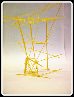

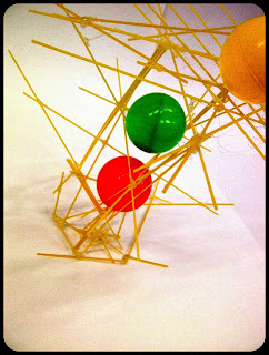

I chose to create a strucutre that the balls will be on a level, so there are 3 levels on my structure, this cretes a better centre of gravity eventhough the building is slanted.
 Having built the structure, i tried turning upside down and on its side, and this has worked rather well. The structure looks rather nicely quite geometric on its side.
By placing a figure it show thje scale of the sturcuture or building, it automatically is refered as something architectual.
 This was poor, but i have learnt from this mistake.

In my sketchbook i done a series of really quick rough sketches, seeing shapes, scale, pattern, support and more then slowly refining them to a more realistic structure for holding the balls.


Quick sketching allows me to experiment, go more crazy in the beginning and refine it down. Even coming up with unrealistic impossible ideas helps me think of the final result, for example i may like a specific part of a design which may be added to the final idea.
< Refined.
All author's own.
During the making of this structure, i didn't realise how fragile and weak the spaghetti was and some changes were made to the design. i developed platforms to be cross hatched and layered so that the support is much more stronger and stable for the balls to sit on. Also by combining 3 or 4 spaghetti helped the strength of he structure, i did this to those who are connected to the ground which then gave the it a much stronger base and better rigidity.
To try and stand out, i tried to make this model more slanted and unrealistic looking, kind of bringing in the idea of breaking laws of physics as structure and building are usually symmetrical due to the centre of gravity etc.


I chose to create a strucutre that the balls will be on a level, so there are 3 levels on my structure, this cretes a better centre of gravity eventhough the building is slanted.

By placing a figure it show thje scale of the sturcuture or building, it automatically is refered as something architectual.
After making this, we were to provide this structure with protection to stop it from being destryoed later on by a basketball. The material allowed was only paper. My initial idea was to fold them into quite rigid stiff paper and slot them in between joints of the spaghetti. This didnt turn out well - my strucutre collapsed as the paper was pushing against the spaghetti with to much force. I only ended up with this....................

 This was poor, but i have learnt from this mistake.
It is always good to find a function, instead of placing balls on the structure which isnt very commercially effective, by placing different items onto my structure i can discover what it can potential be. eg. a phone stand. This structure can then be refined to a much smaller scale which would be more propiate for it to sell in the market.
 |
| I like the amount of contrast the room had with all other strucutres. The bright colour balls contrast and for some part they seem like they are floating in mid air. The colours clash give a rather dramactic effect in my views. |
Tuesday, 24 September 2013
3DD Day 2
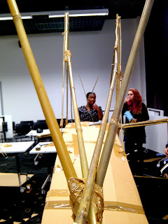
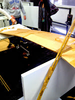
As a group we decided that function was most important here as it has to deliver the car to the other end otherwise it would be a fail, therefore we concentrated on functionality and the stable structure first then aesthetics. We considered the main platform to be a large curve which stretched from one end to the other, at first we were going to just use tape, and soon realised it would be too fragile too support the car. Therefore i came up with the idea of building a structure within the cardboard, by using bamboo and creating a cross internal structure with create a much solid surface for the car to run on. This worked.
After we built the platform, we began to think about aesthetics, having the platform being a curve, we thought of something more angular for a slight contrast. the main support its in the middle of the bridge where 2 bamboo poles are attached to the bridge. We then slowly build the angular shapes on top and sides. for the barrier so the car doesn't fall off, we used tape as this gave more suspension and less rigidity than bamboo, the tension that the tape gives will allow the car to drive through more smoothly.


All Author's Own
Subscribe to:
Posts (Atom)