2) sliding the pen to create marks, flicking the pen on paper creates a wide stroke then gradually thinner. In my point of view it creates a sense of movement.
3) the use of markers and overlaying colours on top of each other to see the strokes made different from each colour. This stood out due to the wide range of colours and obvious strokes.
4) Use of charcoal made the writing less present, more vintage. I used the physical side as the main media , using the charcoal on its side and tip to create the contrast of wide and narrow.
5) while using the charcoal, some of it was left on my fingers, i then started to use this to create prints and control direction of the strokes using my fingers.
6) oil pastels and smudge
7) using a knife to cut the fonts, playing with negative spaces.
8) Pencil shaving and glue to form the word, the texture of dust and lead.
1,5,6 2,3,4,8

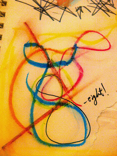
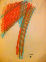
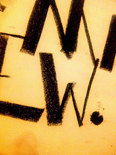
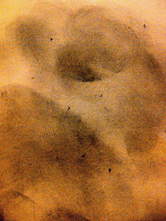
Pictures - All author's own
Other ways which i thought i could also do to make interesting marks are :
Remotew control car and paint
pva + paint
Air gun to explode the ink or paint on paper
creating strokes with hands
wrapping a football with paper and play.

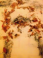
I like how you used the sharpener waste to make letters, and also I love the scribble number 6 it was very clear to me. The other ways to make typography marks that you listed was also great ideas, especially the air gun to explode ink or paint on paper, that idea caught my eye and also would be a great experimentation method. You have shown clear and good experimentation methods to create typography. They were all successful as i could understand what you were trying to communicate.
ReplyDelete